


Elevation
Elevation uses shadows, overlays, and depth cues to distinguish elements on a screen, create hierarchy, and guide user attention.
Philosophy

Elevation communicates depth and importance in an interface.
It creates a visual hierarchy, showing what’s interactive or in focus.
It mimics physical space, making layers intuitive.
It should feel subtle and natural, never distracting.
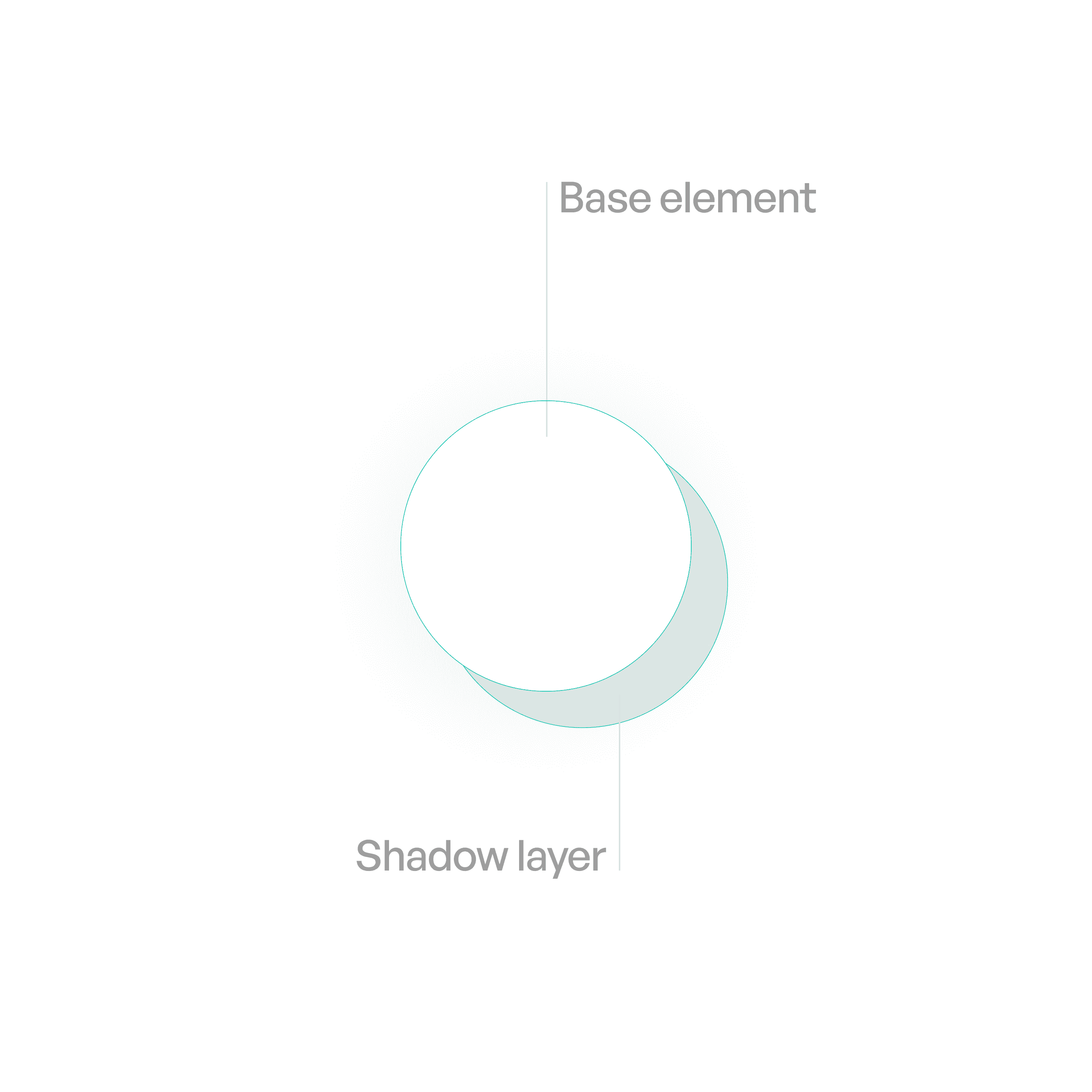
Anatomy
Variants

Primary Elevation
Subtle separation for majority of elements.

Secondary Elevation
For small elements like knobs. (Like toggles and sliders)
Usage tips
Dos
Use elevation to signal interactivity and hierarchy.
Keep shadows consistent across components and platforms.
Use overlays for high-elevation components (modals, sheets).
Don’ts
Don’t overuse shadows — subtlety is key.
Don’t stack multiple strong shadows (causes clutter)
Don’t rely only on shadows to show hierarchy — combine with color/spacing.