


Colors
Colors define the visual identity of the design system and guide the way users interpret information. They establish brand expression, create hierarchy, and convey meaning through tone, emphasis, and accessibility.
Philosophy

Colors are more than decoration — they are a language of meaning.
They express brand personality consistently across touchpoints.
They provide functional cues (success, error, warning).
They ensure legibility and inclusivity when applied with contrast standards.
Anatomy
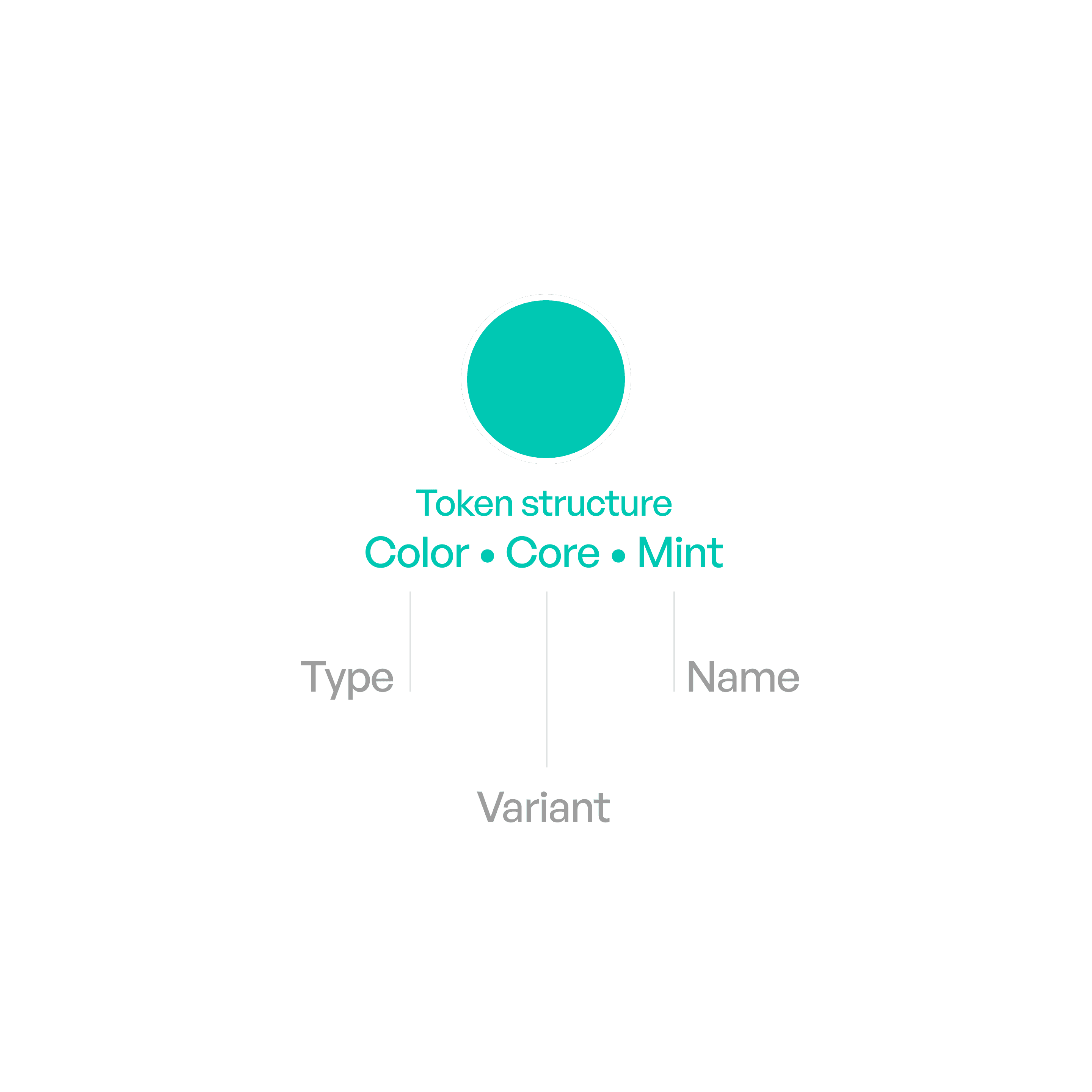
Variants

Core palette
Core colors are mostly used for primary cues. For light and dark mode.
Red
#FF383C
#FF4245
Orange
#FF8D28
#FF9230
Yellow
#FFCC00
#FFD600
Lime
#9DCC29
#A0CC33
Green
#34C759
#30D158
Mint
#00C8B3
#00DAC3
Teal
#00C3D0
#00D2E0
Cyan
#00C0E8
#3CD3FE
Blue
#0088FF
#0091FF
Indigo
#6155F5
#6B5DFF
Purple
#CB30E0
#DB34F2
Pink
#FF2D55
#FF375F
Brown
#AC7F5E
#B78A66

Background
Applied to backgrounds. For light and dark mode.
Primary
#FFFFFF
000000
Secondary
#F5F4F2
#1F1E1E
Elevated
#FFFFFF
#1F1E1E

Grays
Black,White and Gray spectrum
Black
#000000
000000
Gray
#939292
#939290
Gray 2
#B2B1B0
#666564
Gray 3
#CCCBCA
#4A4949
Gray 4
#D6D5D4
#3C3C3B
Gray 5
#EAE9E8
#2E2E2D
Gray 6
#F7F6F5
#1E1E1D
White
#FFFFFF
#FFFFFF

Text and labels.
Applied to text and labels.
Primary
#000000
#FFFFFF
Secondary
#434242
60%
#F5F3F0
60%
Tertiary
#434242
30%
#F5F3F0
30%
Quaternary
#434242
18%
#EBEBF5
18%

Fills
Fills are colors used as backgrounds for controls and interactive elements, helping define shape, state, and hierarchy while adapting to context.
Primary
#808080
12%
#808080
12%
Secondary
#3C3C43
60%
#EBEBF5
60%
Tertiary
#787878
20%
#787878
20%
Elevated
#FFFFFF
#1F1E1E
Liquid glass
#FFFFFF
80%
#1F1E1E
80%
Usage tips

Dos
Use the defined color tokens instead of hardcoded hex values.
Reserve primary colors for primary actions (e.g., buttons, highlights).
Aim for color harmony and balance.
Use semantic colors for functional roles (e.g., red = error).
Don’ts
Don’t introduce arbitrary new colors outside the palette.
Don’t use color alone to communicate meaning — pair with text/icons.
Don’t overload interfaces with too many accents.