Charts
Charts are visual representations of data that help users understand trends, patterns, and relationships more easily than raw numbers.
Philosophy

Labels exist to clarify meaning and reduce ambiguity.
They make UI elements self-explanatory.
They strengthen recognition over recall, so users don’t guess.
They ensure consistency across inputs, buttons, and navigation.
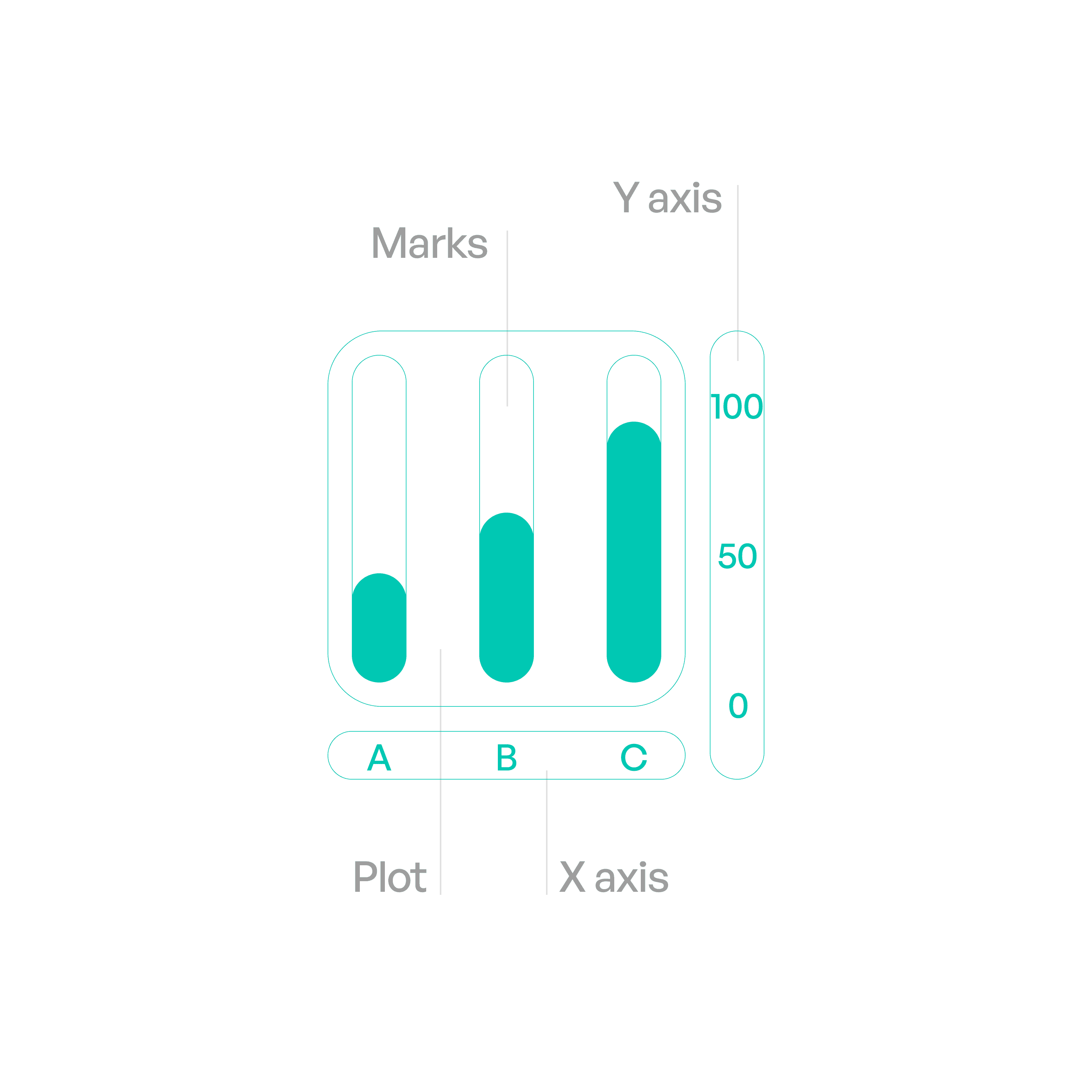
Anatomy
Variants
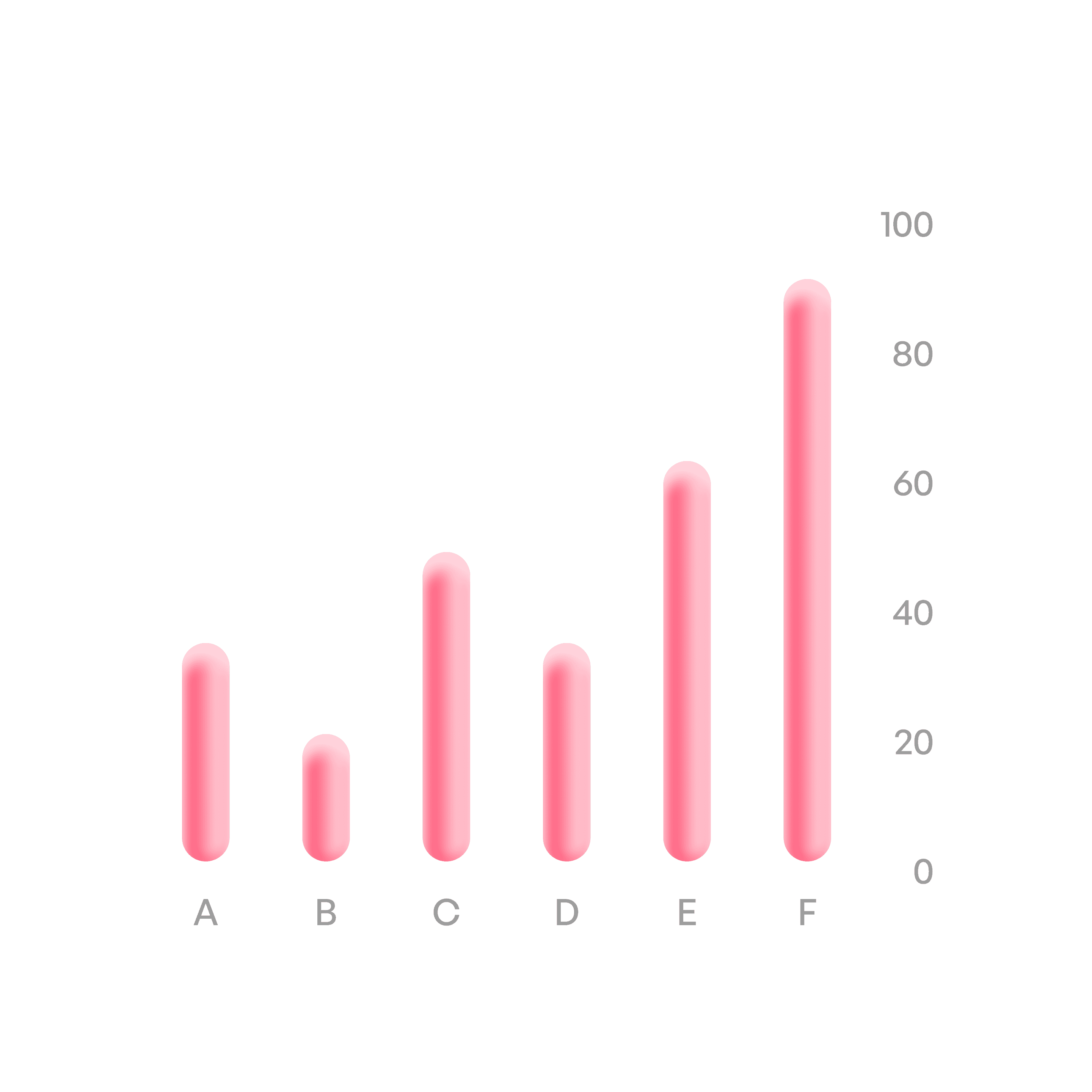
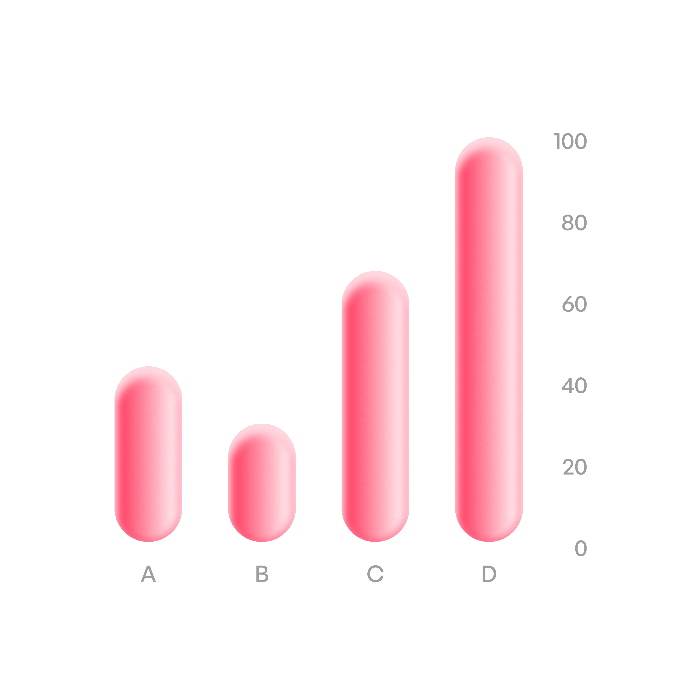
Vertical bar chart
Compare categories.
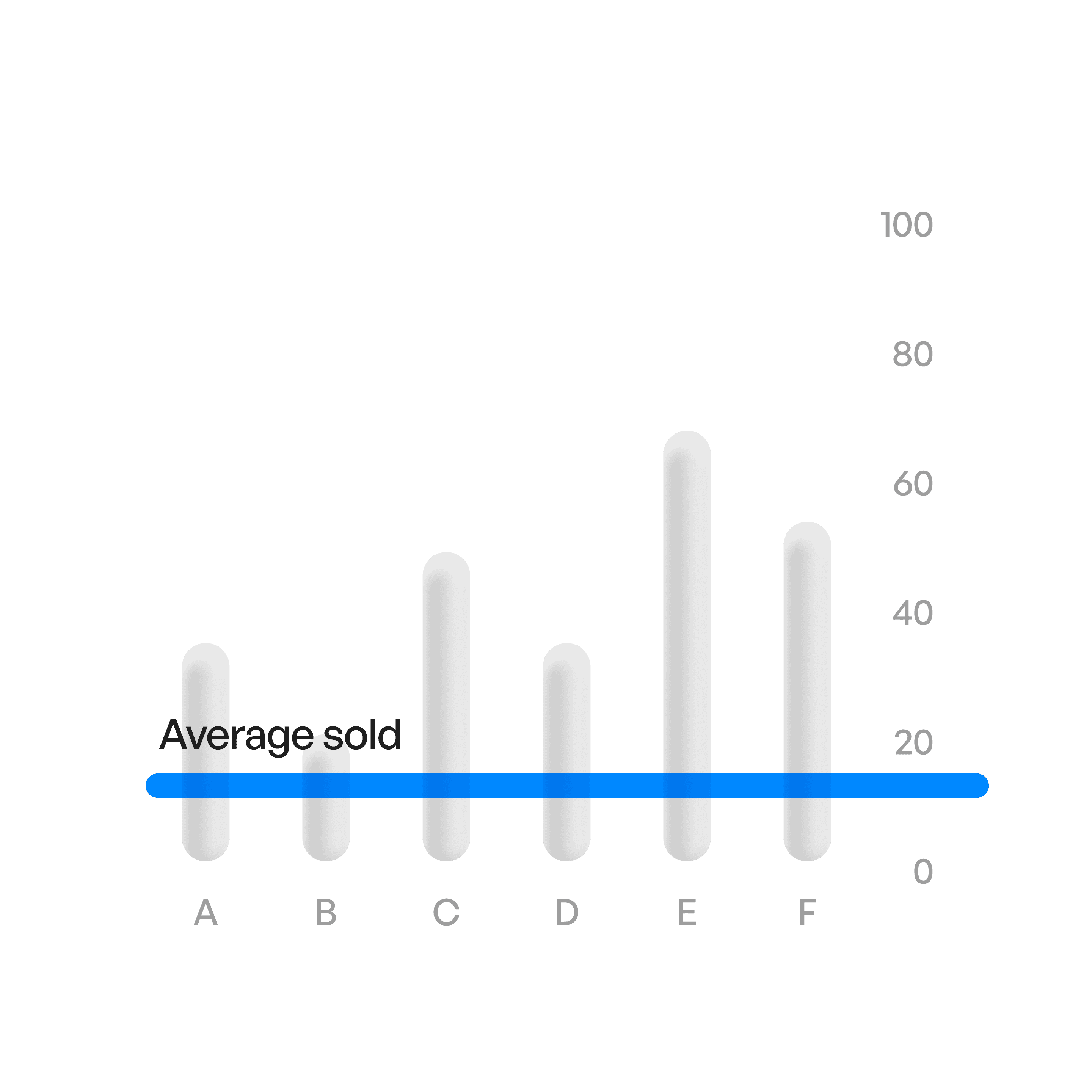
Bar chart average
A line shows average.
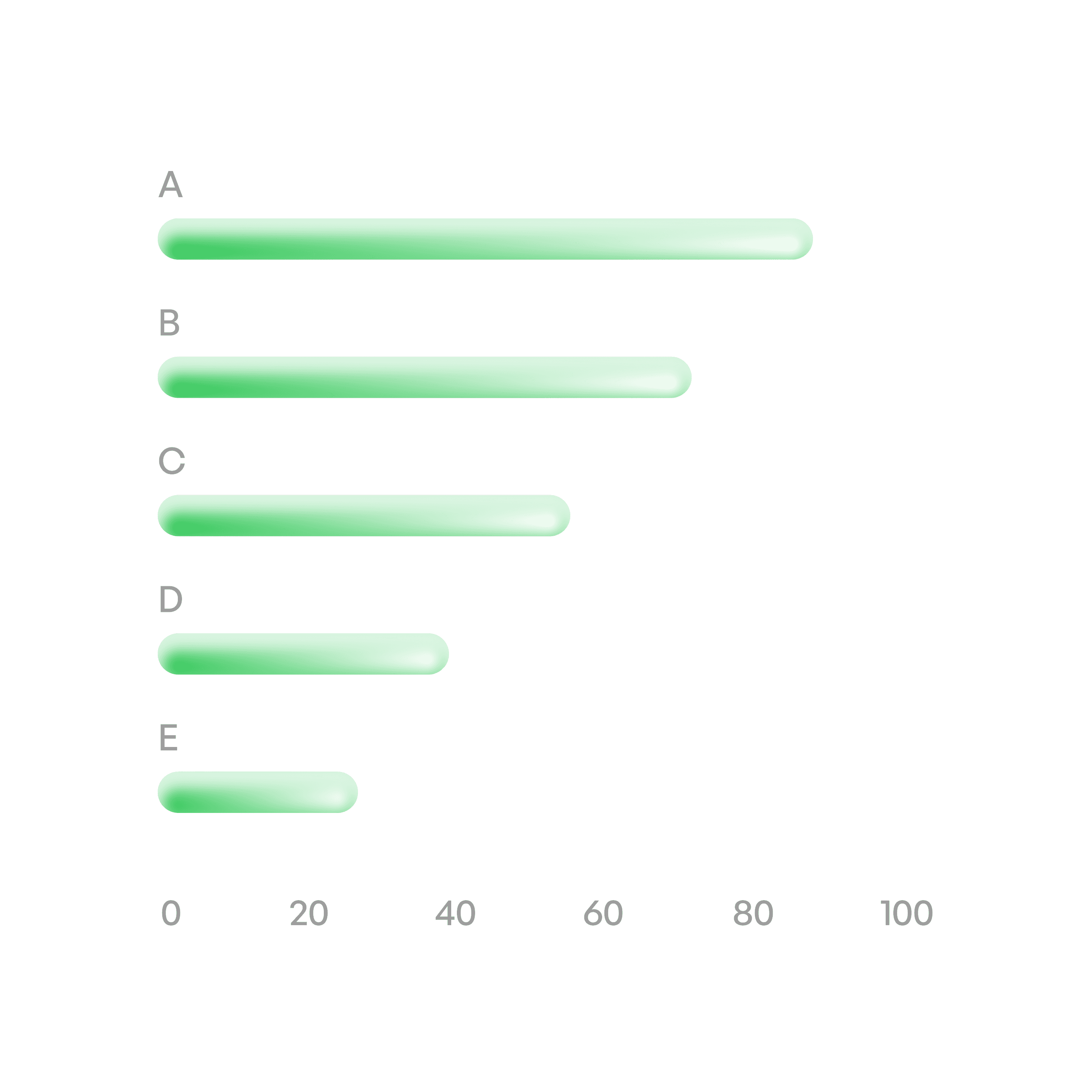
Horizontal bar chart
Compare categories.
Vertical proportion
Show proportions of a whole.
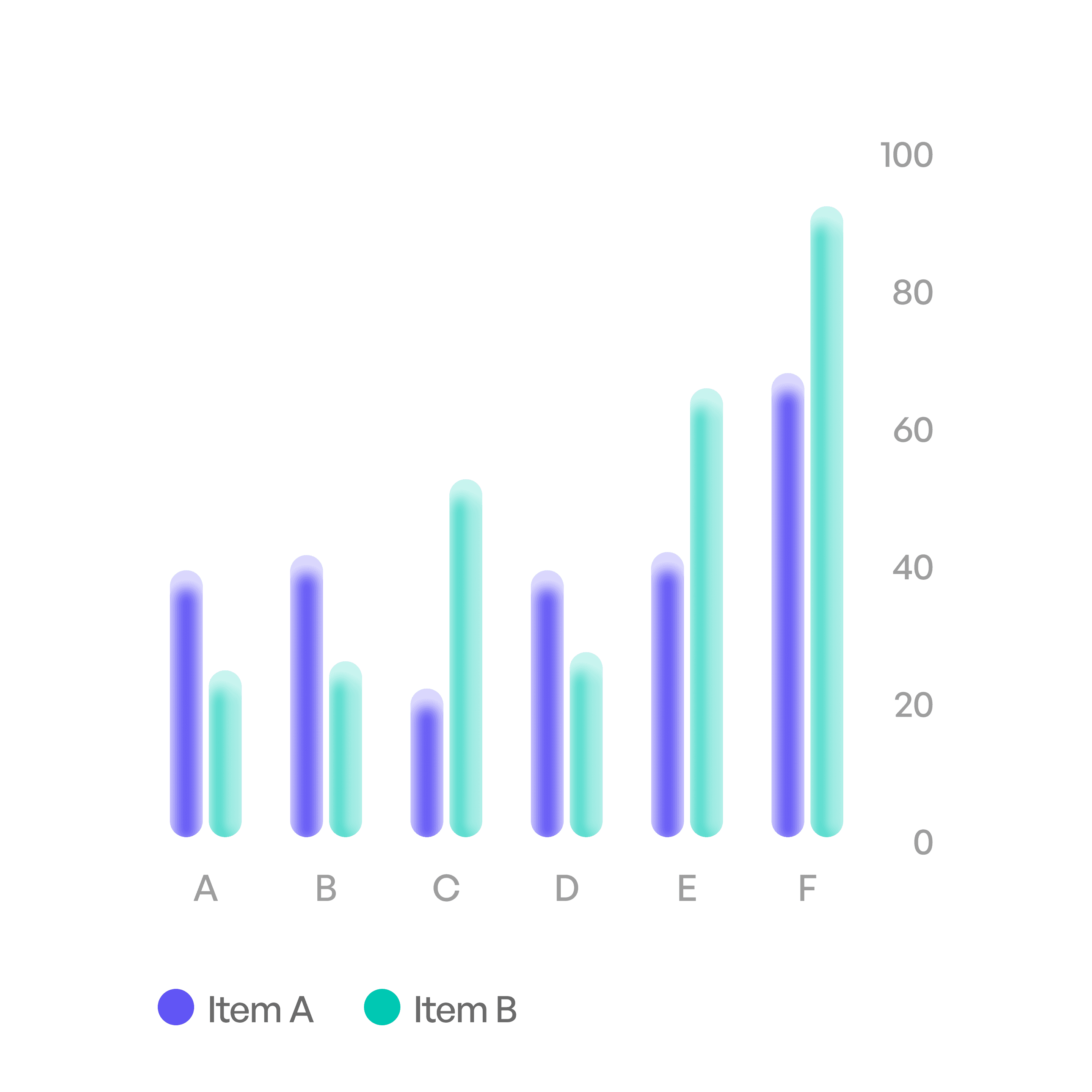
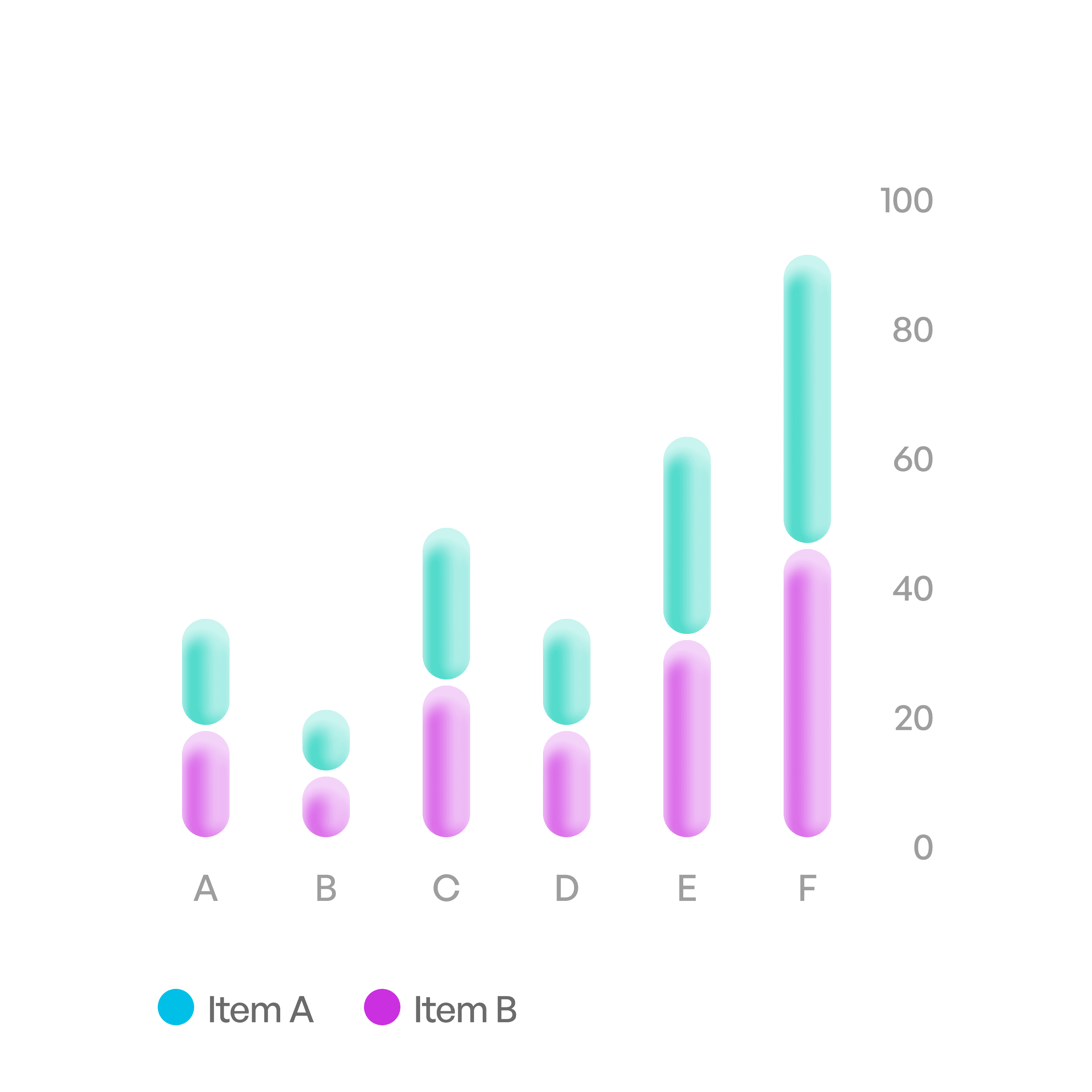
Vertical bar comparison
Compare data in same categories.
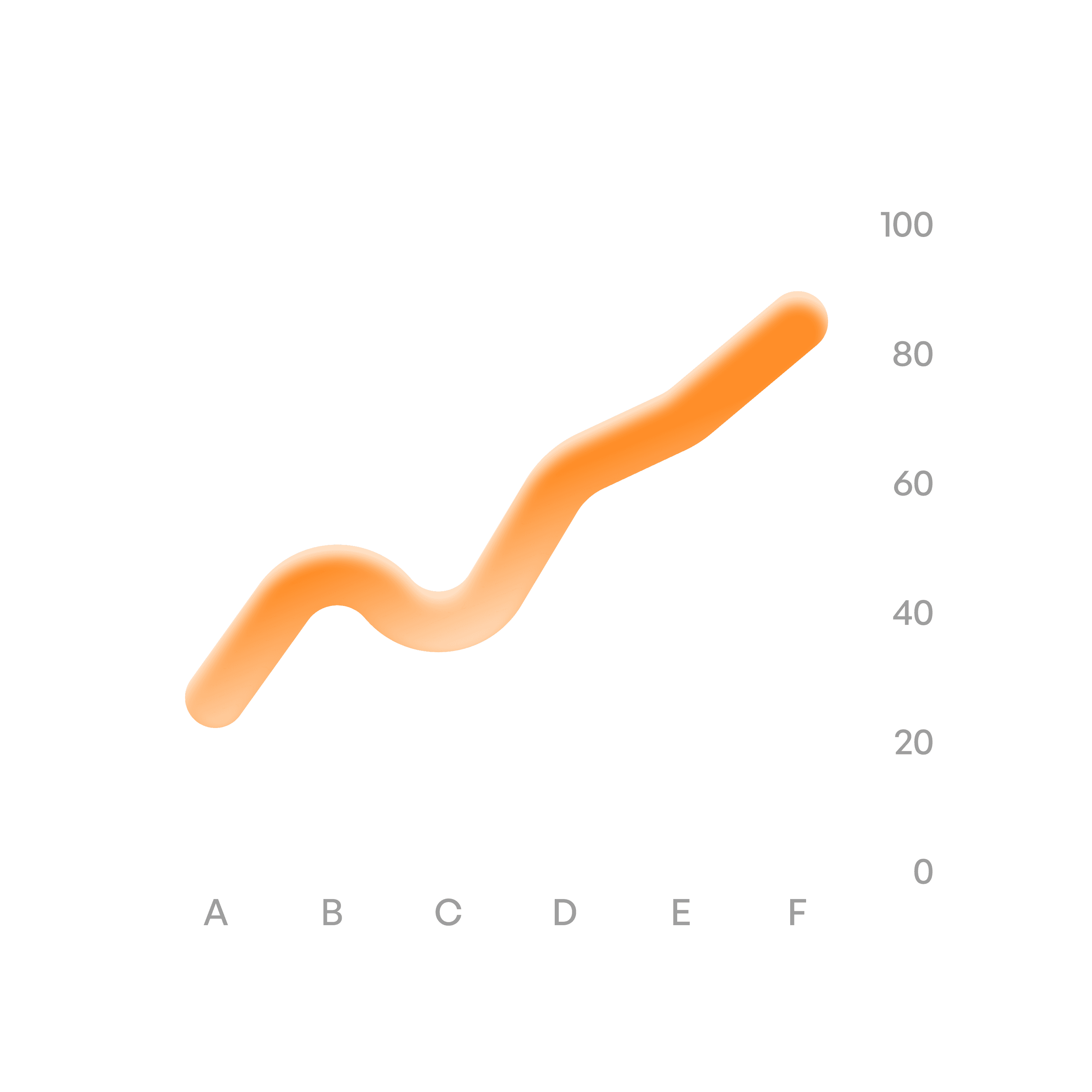
Trend chart
Show trends over time.
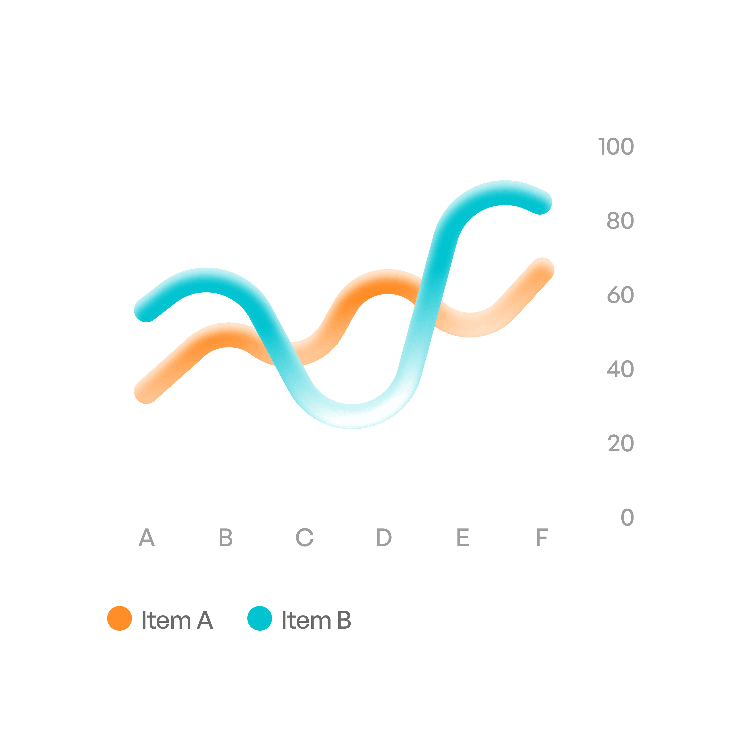
Trend comparison
compare trends over time.
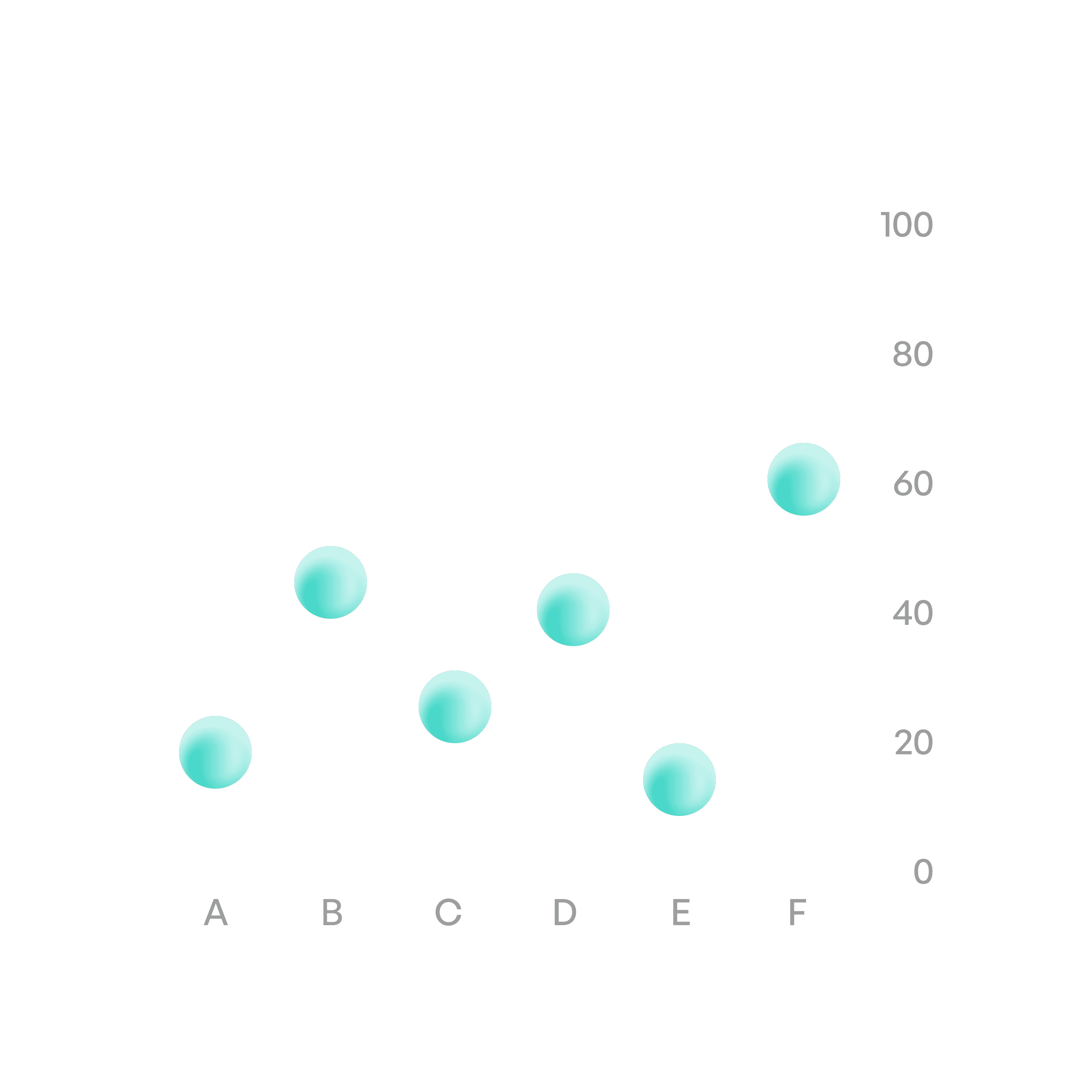
Scatter plot
Show relationships between variables.
States
Idle
Static display of data.
Usage tips
Dos
Choose the right chart type for the data (bar for categories, line for time).
Label axes, legends, and data clearly.
Use color sparingly and consistently to aid comprehension.
Provide interactivity (tooltips, filters) for large or complex datasets.
Don’ts
Don’t overload charts with too much data — it reduces clarity.
Don’t rely only on color to differentiate categories.
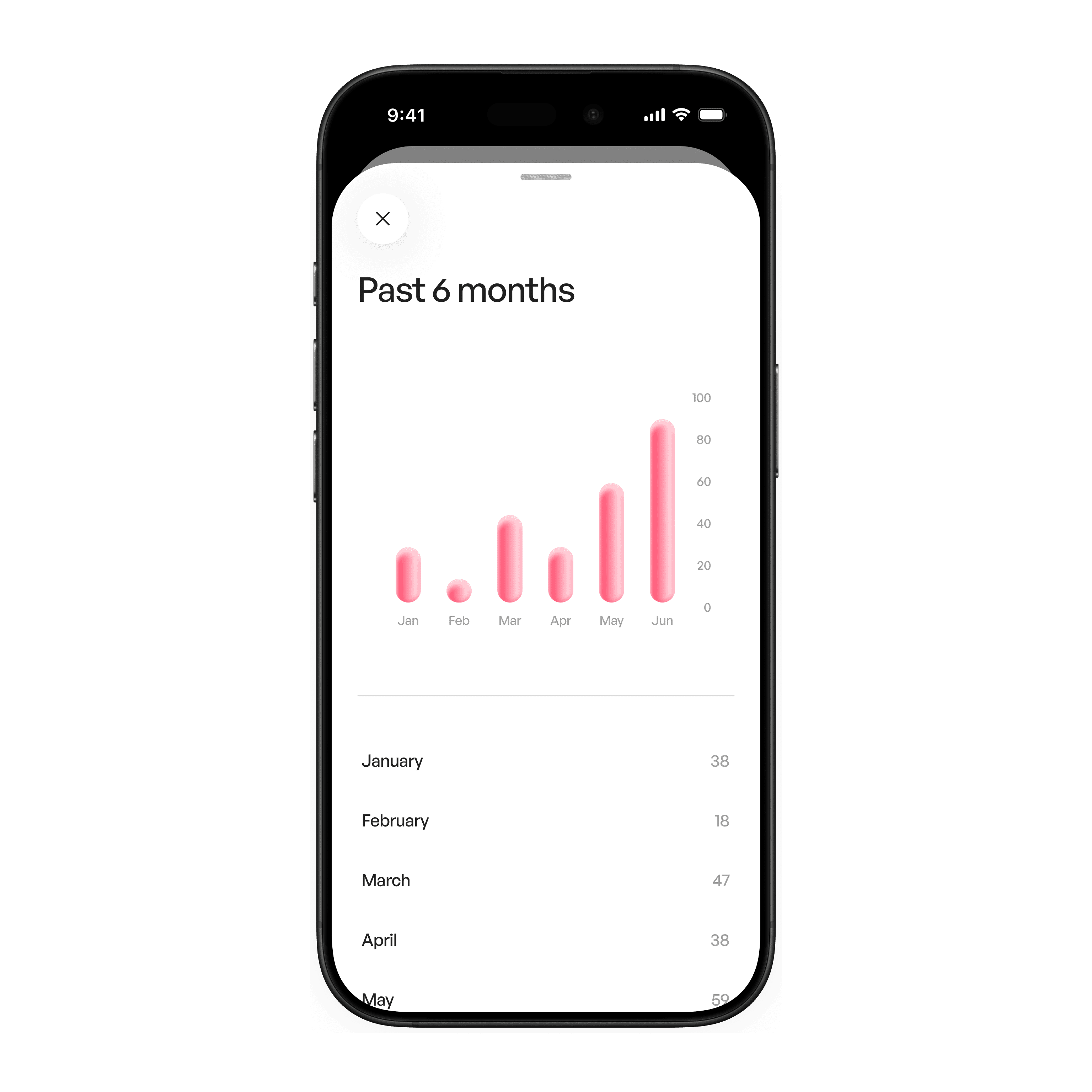
Real-world example