


Pull-down button
A pull-down button is a control that reveals a menu of related options when pressed.
Philosophy

The pull-down button combines a button and a menu into a single component, reducing clutter while keeping actions close to their context.
Keeps interfaces clean by hiding secondary actions.
Groups related commands under one clear entry point.
Prioritizes the main task while making alternatives accessible.
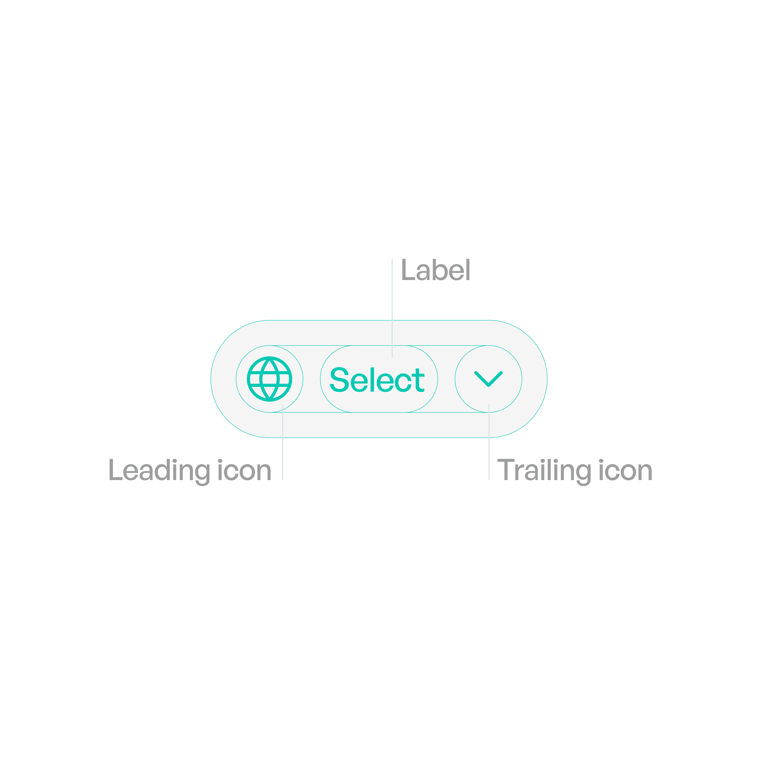
Anatomy
Variants

Text Pull-Down
Label only.
Icon + Label
Icon reinforces meaning.

Icon-Only
Reserved for universal actions (e.g., settings).
States

Idle
Displays the button label (and optional icon/indicator).

Menu Active
Options visible until a choice is made or dismissed.
Usage tips
Dos
Use for related secondary actions, not critical primary actions.
Keep menu options concise and task-oriented.
Use separators for logical grouping when menus are long.
Don’ts
Don’t overload menus with unrelated items.
Don’t use pull-downs for navigation across entire apps (use a navigation bar instead).
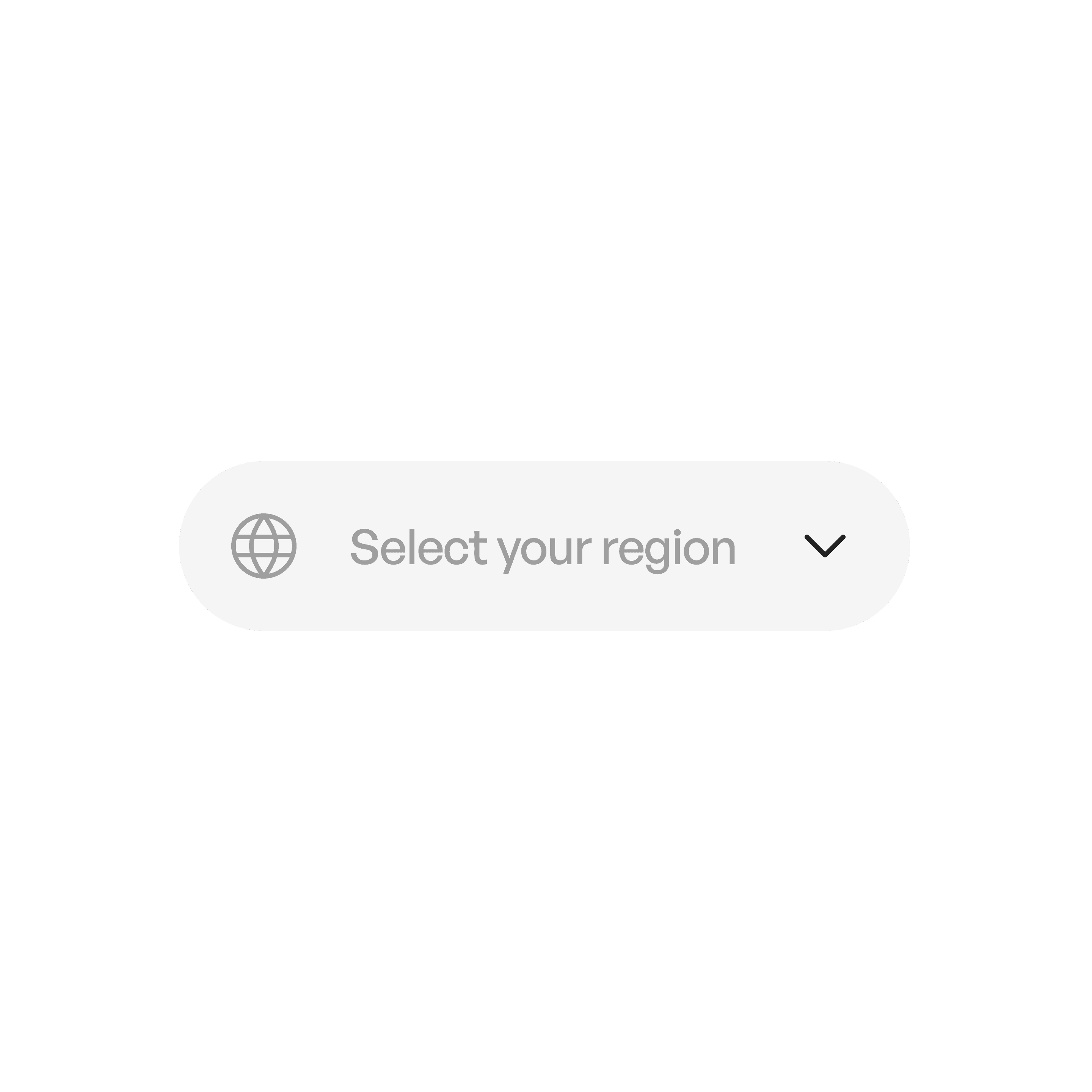
Real-world example
