Visual Hierarchy in UX Design: Guiding Attention for Clarity & Ease
Open any great product and notice how your eyes move.
You know exactly where to look first, what matters most, and what you can safely ignore.
That’s not an accident.
That’s visual hierarchy — the quiet architecture beneath every intuitive interface.
And without it, even beautiful designs feel confusing, heavy, or directionless.
1. What Is Visual Hierarchy? (Definition)
Visual hierarchy is the deliberate arrangement of elements so users instantly understand:
What’s important
What comes next
What’s secondary
What they can ignore
It’s how you design attention, not just layouts.
Hierarchy decides where the eye lands first — and where the user’s mind follows.
2. The Psychology Behind It
Humans don’t read screens. We scan them.
Our eyes follow predictable patterns shaped by psychology:
1. Perceptual dominance
Bold, large, high-contrast elements pull attention instantly.
2. Gestalt grouping
We perceive elements in groups, not as isolated pieces.
3. Pre-attentive processing
Color, size, spacing, shape — we detect these before conscious thought kicks in.
4. Cognitive load reduction
Good hierarchy reduces mental effort by giving the user a clear starting point.
When hierarchy works, a screen “feels simple.”
When it fails, the user feels lost.
3. Why Visual Hierarchy Matters in UX
Because without hierarchy:
users don’t know where to start
CTAs get ignored
onboarding becomes confusing
forms feel overwhelming
interfaces feel “cluttered” even if technically minimal
decision-making slows down
Hierarchy is not decoration.
It’s how design creates meaning.
The moment you guide the eye, you guide the experience.
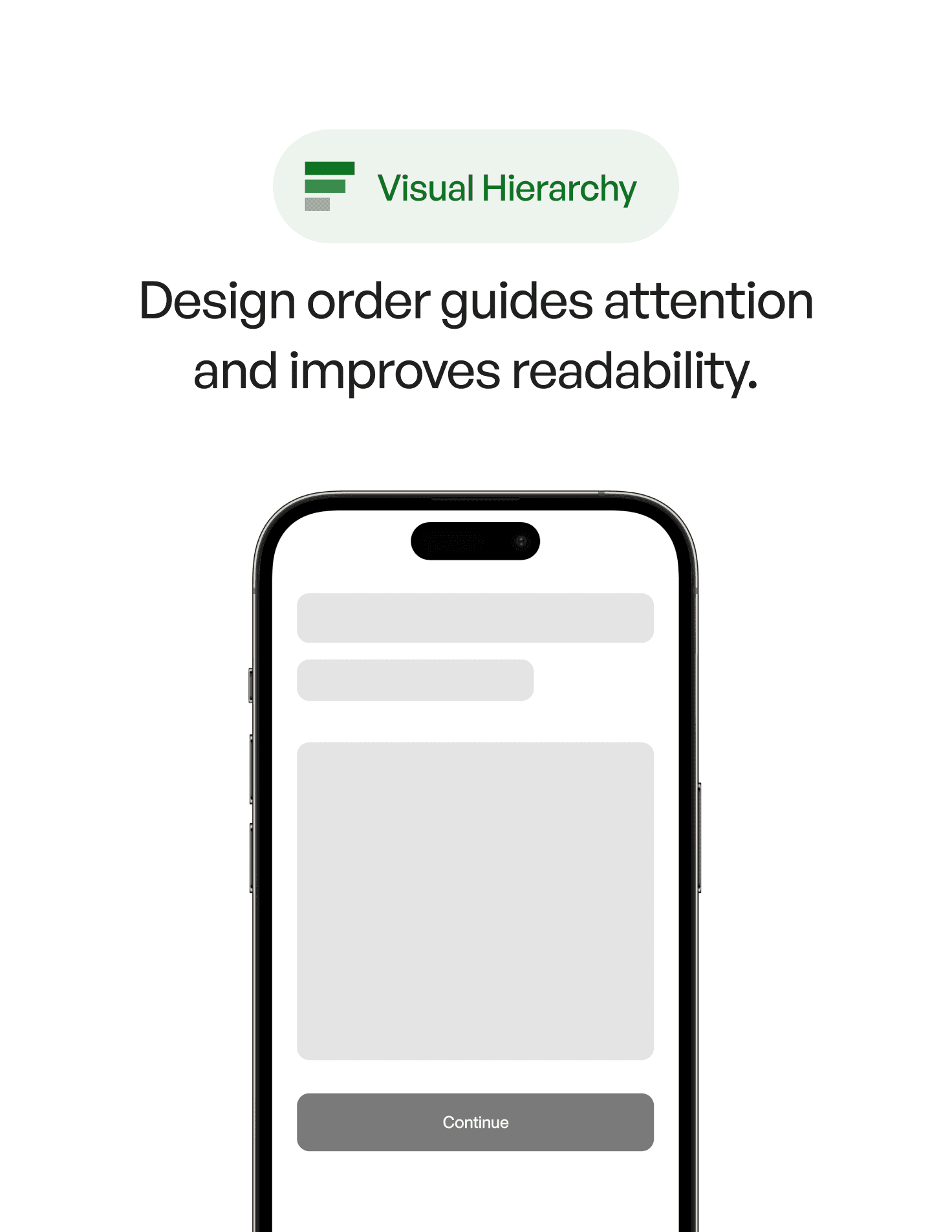
4. Real-World Example
Imagine a payments dashboard:
Version A
All text the same weight
Multiple actions with equal emphasis
No spacing rhythm
Colors competing for attention
The user hesitates. Nothing feels clear.
Version B
A bold headline sets context
A clear primary action stands out
Secondary actions are quiet and aligned
Spacing creates rhythm — almost like breathing room
Color is intentional, not decorative
The second screen looks “clean,” but more importantly:
it feels trustworthy and effortless.
This is the emotional impact of hierarchy.
5. Common Mistakes (And How to Avoid Them)
❌ Mistake 1: Everything looks equally important
Fix:
Decide the one thing users must notice first — design around it.
❌ Mistake 2: Overusing color and contrast
Colors fight for dominance.
Fix:
Use one “loud” color and let the rest stay quiet.
❌ Mistake 3: Ignoring spacing rhythm
Crowded screens feel heavy.
Fix:
Spacing is hierarchy. Treat it like typography.
❌ Mistake 4: Making secondary actions look primary
This creates hesitation.
Fix:
Tone down secondary actions through weight and placement.
❌ Mistake 5: Inconsistent typographic levels
Users rely on type scale to understand structure.
Fix:
Define headings, labels, body text, captions — and stick to them.
6. How to Apply Visual Hierarchy (Practical Techniques)
1. Start with the first glance
Ask: Where should the user look in the first 200 milliseconds?
Build from that anchor.
2. Contrast is your strongest weapon
Hierarchy is about difference — size, weight, color, shape.
A small shift transforms how a screen is read.
3. Use spacing to create rhythm
Whitespace is not empty — it’s structure.
4. Align elements into groups
Grouping reduces cognitive load and clarifies relationships.
5. Make the primary action unmistakable
The user should never wonder, “What do I tap now?”
6. Establish a clear typographic system
Your type scale is your visual grammar.
7. Key Takeaways
Visual hierarchy guides the user’s eye and reduces mental effort
Contrast, spacing, size, alignment, and color are your building blocks
Good hierarchy creates clarity; bad hierarchy creates confusion
Users don’t read — they follow the path you design for them
Hierarchy is emotion, structure, and intention combined
📘 Want to Go Deeper Into UX Psychology?
If you want to master 100+ principles that shape how users see, feel, and understand interfaces, explore
User Psychology 3 — our complete handbook for applying psychology in digital design.