Visual Anchors in UX: How to Design for Fast Perception
Apr 27, 2025
Users don't read first.
They scan.
They search for something familiar — a starting point.
That starting point? It’s called a visual anchor.
If you design great anchors, users find their way naturally.
If you don’t, they get lost — and leave.
Let’s break down how visual anchors work in UX — and how to use them well.
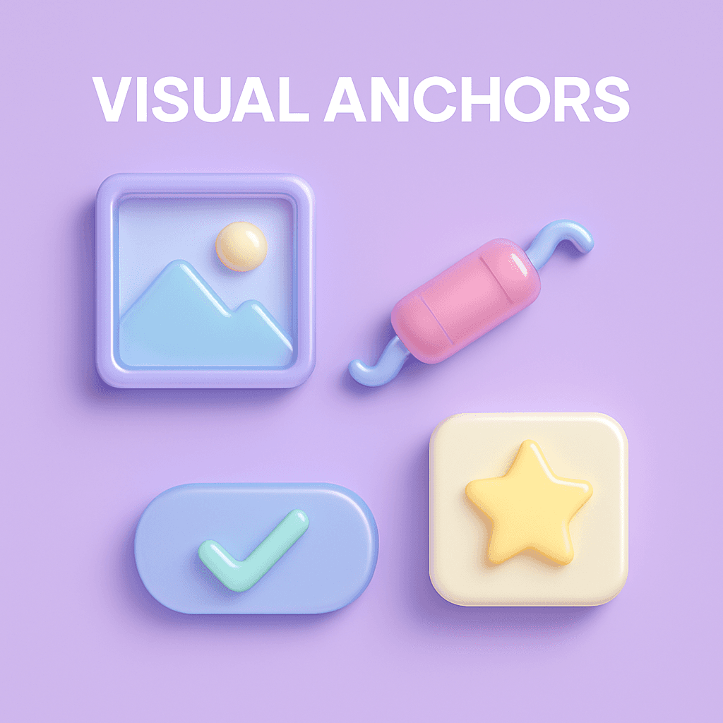
🧠 What Are Visual Anchors?
Visual anchors are elements that immediately catch attention and give users a sense of orientation.
They're like signposts in a city:
Headings
Buttons
Icons
Profile pictures
Logos
Progress bars
When users land on a screen, their brain automatically looks for visual anchors to build a mental map.
Good anchors create confidence.
Bad or missing anchors create confusion.
🔍 Why Visual Anchors Matter
Faster comprehension: Anchors guide the eyes where they need to go.
Lower cognitive load: Users don't have to figure out "what matters."
Stronger focus: Anchors shape the flow of attention.
Emotional clarity: Good anchors create a feeling of orientation and control.
💬 Without anchors, even simple screens feel overwhelming.
🎯 How to Design Effective Visual Anchors
1. Make the Primary Action Loud
✅ Use contrast, color, and size to highlight the main button
✅ Make sure it's visually distinct from secondary actions
💬 Users should instantly know “what to do next.”
2. Guide Attention With Visual Hierarchy
✅ Use bigger fonts for headlines
✅ Use boldness, color, or placement to signal importance
✅ Keep spacing consistent to group related elements
💬 Your screen should "tell a story" without reading.
3. Use Recognizable Icons or Images
✅ Use familiar shapes and metaphors
✅ Don’t over-design or reinvent basic symbols
💬 Recognition is faster than thinking.
4. Place Anchors Where Eyes Naturally Go
✅ Top-left or center for logos and headlines
✅ Bottom-right for action buttons on mobile
✅ Top-right for settings, carts, or profile menus
💬 Design with scanning patterns (like F-pattern or Z-pattern) in mind.
5. Limit Competing Anchors
✅ Avoid multiple loud elements fighting for attention
✅ Choose one primary anchor per screen
💬 Clarity wins over visual noise.
✨ Real-World Examples
Google's Search Page: Giant search bar = single anchor
Instagram Stories Bar: Immediate tap targets at the top
Dropbox’s Empty State: Big colorful illustration and one clear CTA
💬 They don’t make you think where to start. They show you.
📘 Want More UX Psychology Techniques?
Visual anchors are just one part of building intuitive design.
If you want to learn more cognitive principles that boost usability, check out User Psychology 3.
It’s filled with actionable, beautifully visualized psychology for product designers.