Modular Design System Guide: Build Scalable, Flexible UI
May 22, 2025

💭 Intro
Design systems often start with good intentions… and end as bloated libraries no one enjoys using.
We’ve been there — spending hours trying to customize a “universal” component only to realize it breaks five others. That’s why modularity isn’t just a nice-to-have — it’s essential.
In this guide, we’ll explore how modular design systems simplify product development, scale effortlessly across teams, and stay usable — even as your product evolves.
📘 What Is a Modular Design System?
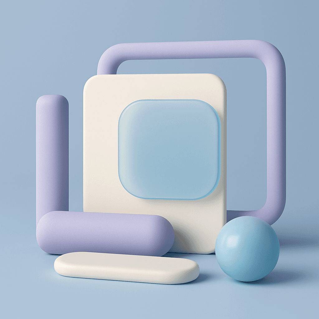
A modular design system is built from interchangeable, independent parts — like LEGO bricks.
Instead of hard-coded templates or rigid UI kits, modular systems offer atomic or component-based elements that can be mixed, matched, and extended without breaking the whole.
Think: buttons, toggles, inputs — all designed to work together, but independently manageable.
🔍 Why It Matters in Product Design
Modular systems are the backbone of scalable design:
Designers can work faster without reinventing the wheel
Developers can implement components with fewer bugs
PMs get consistent interfaces across features
Teams spend less time aligning and more time building
But most importantly: users feel it. Clean, consistent, intuitive interfaces come from modular thinking.
🛠 How to Build a Modular Design System
Here’s how we approached it with Design System 2 — and how you can apply the same mindset:
Start small, think atomic. Begin with base-level components (e.g. buttons, fields), not screens. Each should work alone.
Design for combinations. Build with flexibility — can this card hold different images? Can this list item expand? Modularity lives in intentional constraints.
Keep styles isolated. Avoid global overrides. Create themes, tokens, and layers of customizability.
Document relationships clearly. In Design System 2, we document what breaks when you tweak — so teams don’t fear experimentation.
Test at the edge. Try breaking the layout. Nest components. Push them. If they hold up, you’ve built something real.
🧠 Real-World Example
In Design System 2, we designed each component to feel like a small, beautiful building block.
Each one — whether it’s a dropdown or a card — is:
Fully customizable (from tokens to behavior)
Designed to work beautifully on its own or in clusters
Built in both light mode and our playful “Material” mode (a translucent, spatial feel)
This lets teams ship fast — without losing personality.
⚖️ Bonus Tip: Modular ≠ Boring
Some designers fear modularity leads to dull, repetitive UIs.
Not true.
With smart token theming and thoughtful component architecture, you get both consistency and creativity — the holy grail of product design.
📗 Want a design system that’s already modular?
Design System 2 was built to solve this exact problem — fully modular, beautifully simple, and customizable from the ground up.
It’s the toolkit we wish existed: designed for startups, solo designers, and teams who want to build fast without sacrificing quality.
2025 Sigma. All rights reserved. Created with hope, love and fury by Ameer Omidvar.