Minimalist UI Kits: Why Designers Prefer Clean Over Complex
May 25, 2025

💭 Intro
Cluttered design is out. Clean interfaces are in.
Whether you’re building a SaaS dashboard or a mobile app, users expect clarity — not chaos. That’s why minimalist UI kits are on the rise.
Let’s explore why minimalist design wins, what to look for in a UI kit, and how to pick one that actually helps you ship faster.
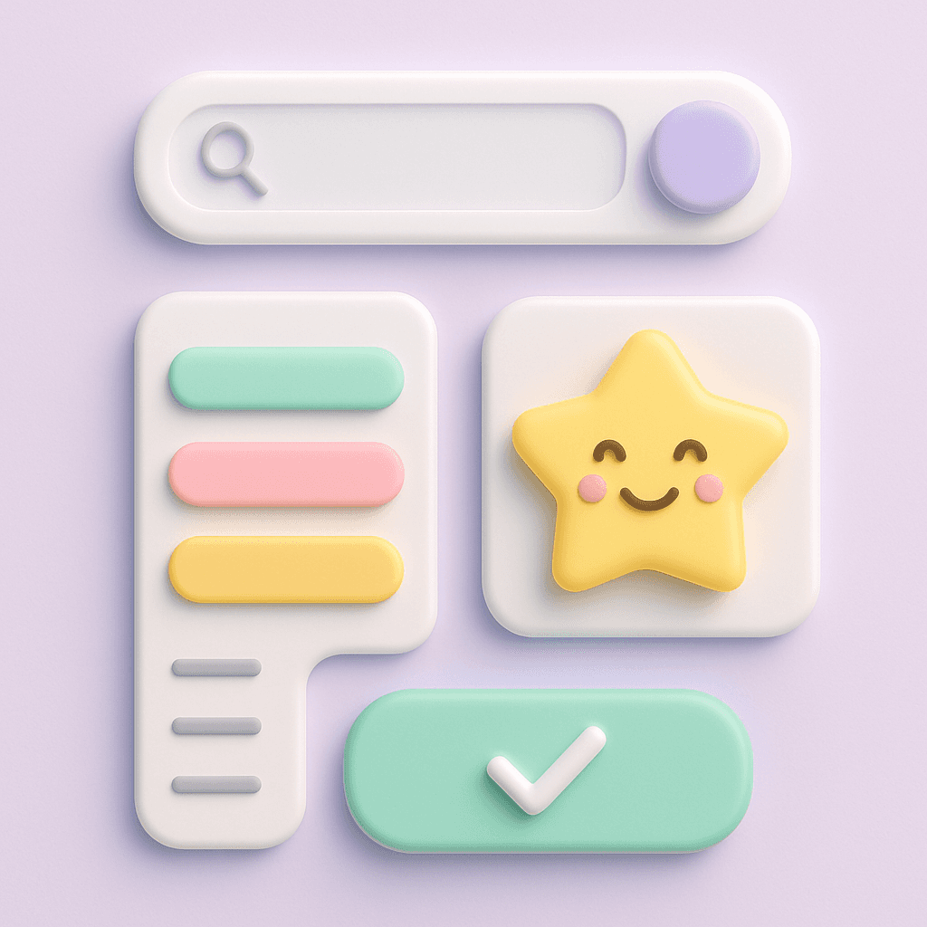
📘 What Is a Minimalist UI Kit?
A minimalist UI kit is a set of pre-designed UI components that follow a clean, uncluttered visual style. Think:
Soft colors
Clear hierarchy
Generous spacing
Simple, readable typography
No extra noise
Minimalist kits help you move fast and look polished — without drowning in design complexity.
🔍 Why Minimal Design Works
Minimalist UIs aren’t just trendy — they’re usable.
Less cognitive load → Users don’t have to think as hard
Faster decisions → CTAs stand out
More trust → Simplicity signals professionalism
Better accessibility → Clearer layouts help more people
The cleaner the canvas, the easier it is to focus.
🛠 What to Look for in a Minimalist UI Kit
Here are 5 things to check before you download or buy:
Design tokens included?
Tokens = scalable styling. Look for color, spacing, and typography tokens.Responsive layout support?
A great UI kit works on desktop and mobile — without hacks.Light + dark modes?
Bonus if it includes soft theming options (like our Material mode 👀).Customization options?
Can you tweak it without breaking it? A good kit should be flexible.Clean documentation?
You want clarity, not another Figma maze.
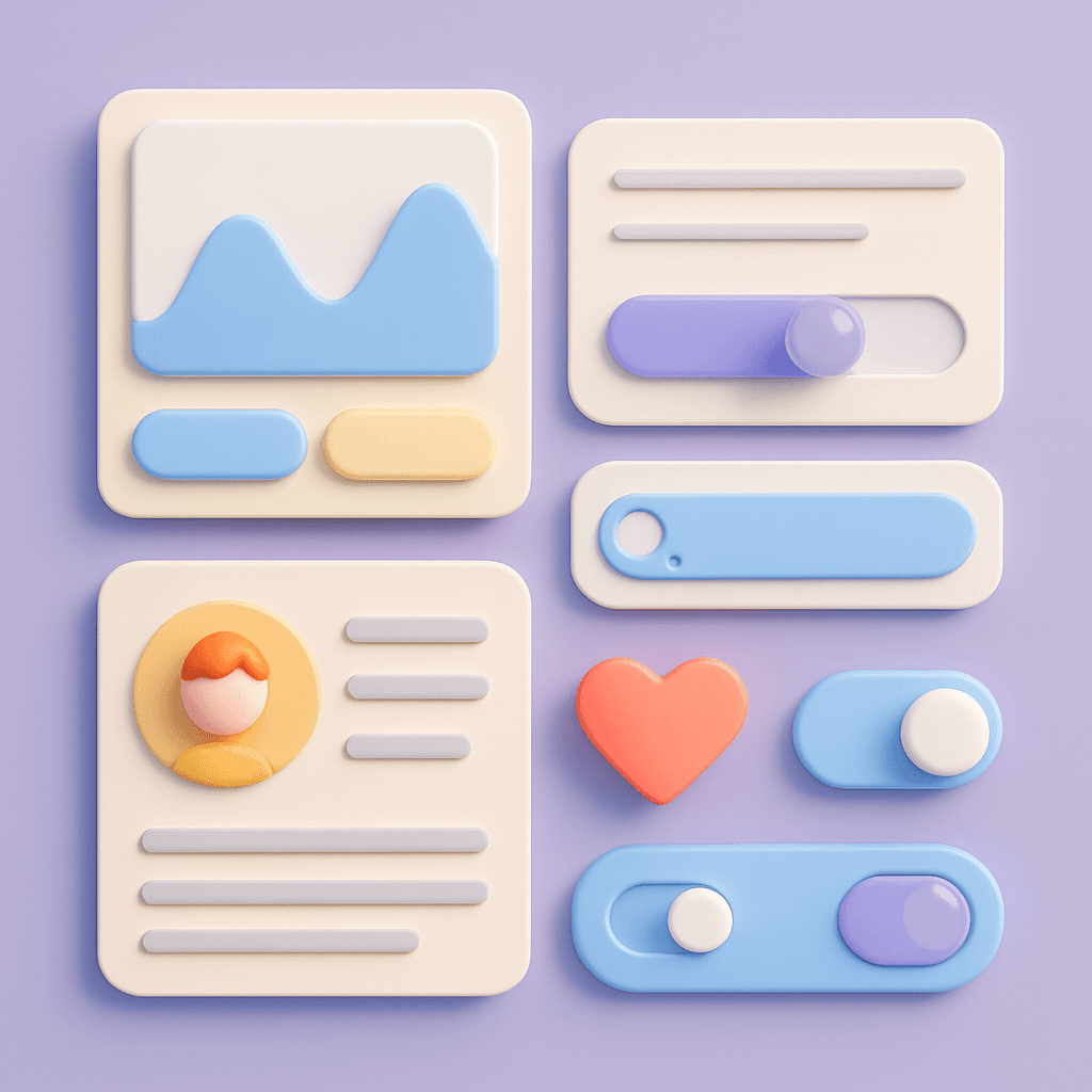
🧠 Real-World Example: Design System 2
Design System 2 was designed to be beautifully minimalist — but powerful underneath.
You get:
Over 150 modular components
Fully tokenized styles
Three modes: Light, Dark, and Glass Material
Clean, readable typography and soft shadows
And it’s all wrapped in a cohesive, visual-first structure that feels as good to use as it looks.
⚖️ Bonus Tip: Don’t Mistake Minimal for Bare
Minimal doesn’t mean empty — it means intentional.
Look for UI kits that do less, better — not just “less.”
📗 Want a minimalist UI kit that’s actually fun to use?
Design System 2 is crafted for speed, clarity, and customization. It looks simple — because under the hood, it is.
No fluff. Just thoughtful components that help you move fast and design well.