Minimal Design System for Figma (Clean + Ready to Use)
May 16, 2025
Minimal doesn’t mean empty.
It means clear, intentional, and fast.
If you’re looking for a minimal design system for Figma, this one is built for real-world use — with just the essentials, and none of the clutter.
🧩 Why Go Minimal?
Most design systems try to cover everything.
That’s great… until you can’t find the button you need.
A minimal design system gives you:
Clean structure without complexity
Only what you need to ship real products
Simplicity that scales
💬 The goal isn’t more components — it’s less friction.

🎨 Introducing: Sigma Design System
Sigma Design System is a modular, Figma-native system designed for speed, clarity, and just enough structure.
It comes in two kits:
Starter — for fast UI building
Complete — for full documentation, themes, and scaling
✅ What Makes It Minimal (and Useful)
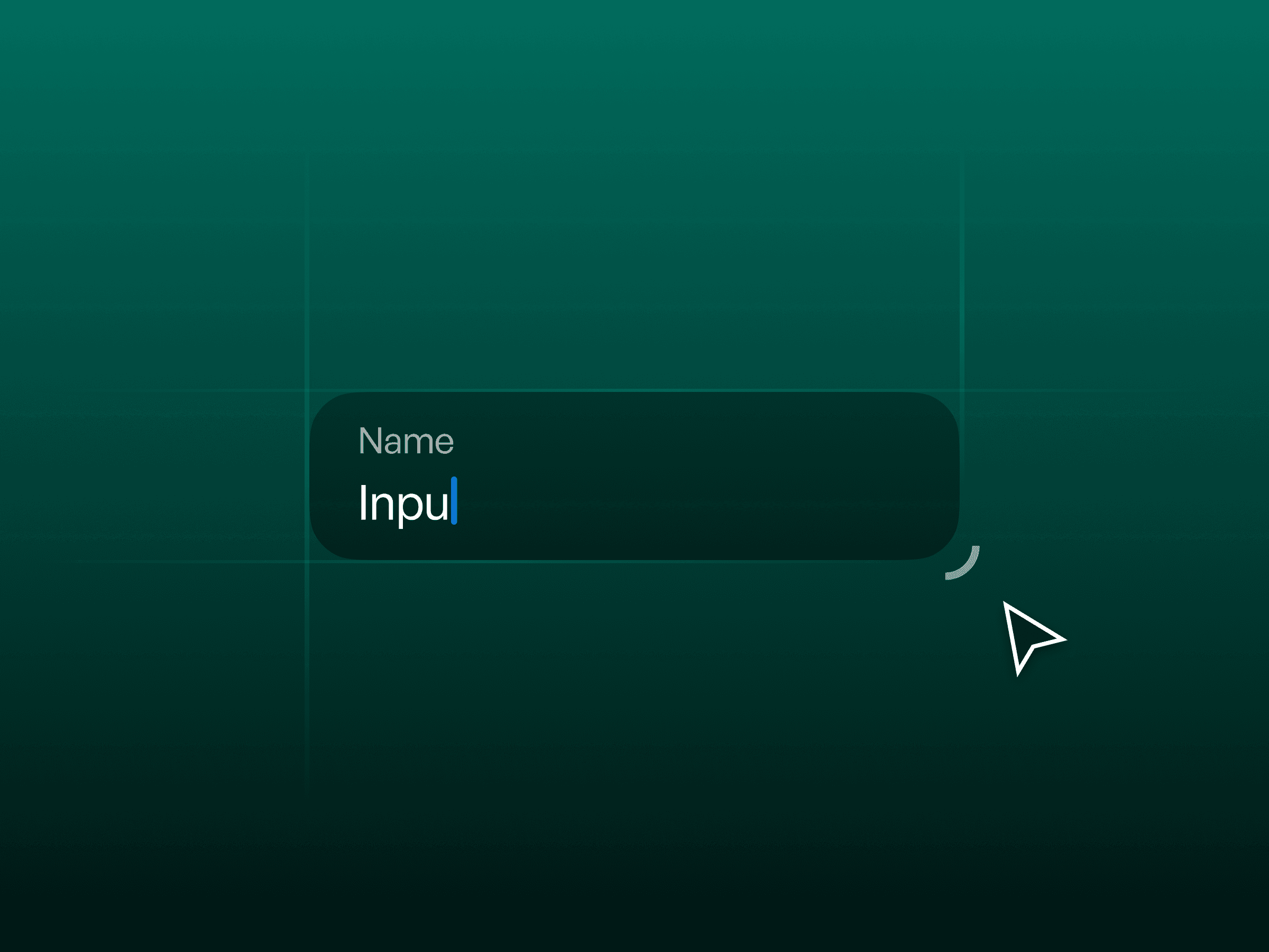
Core components: buttons, inputs, forms, cards, nav, tags
Clean design tokens: spacing, color, typography, radius
Light/dark mode toggle via Figma variables
Built with auto layout + minimal constraints
Clear folder structure, no bloat
Designed to be readable, editable, and brandable
🧘 Who It’s For
Designers who want to move fast
Startups tired of bloated files
Freelancers building repeatable UIs
Makers who care about elegance and logic
💬 Why Designers Love It
“No filler. Just clean, usable patterns.”
“Finally — a design system that feels minimal and actually works.”
“Exactly what I needed to get my product off the ground.”