Loss Aversion in UX: Why Users Fear Losing More Than Gaining

When people use your product, they’re not always thinking about what they’ll gain.
They’re thinking about what they might lose.
This is the power of loss aversion — a deeply rooted psychological bias that affects decision-making across all types of user interfaces.
If your UX ignores it, users hesitate. If you design with it, users feel safe, confident, and more likely to take action.
🧠 What Is Loss Aversion?
Loss aversion is a cognitive bias that says:
People feel the pain of losing something more intensely than the pleasure of gaining something of equal value.
In UX, this means:
Users fear clicking if they’re unsure of the outcome
They avoid features they don’t fully understand
They overvalue what they already have
💬 Your product isn’t just competing with better options — it’s competing with the fear of loss.
🔍 Examples of Loss Aversion in UX
1. Pricing & Trial Flows
💥 Problem: Users hesitate to upgrade because they fear wasting money.
✅ Design Fix:
Use free trials with clear value timelines
Offer “cancel anytime” reassurance
Highlight what they’re missing by not upgrading
“You’re about to lose access to [Feature X]” is more effective than “Upgrade to unlock [Feature X]”.
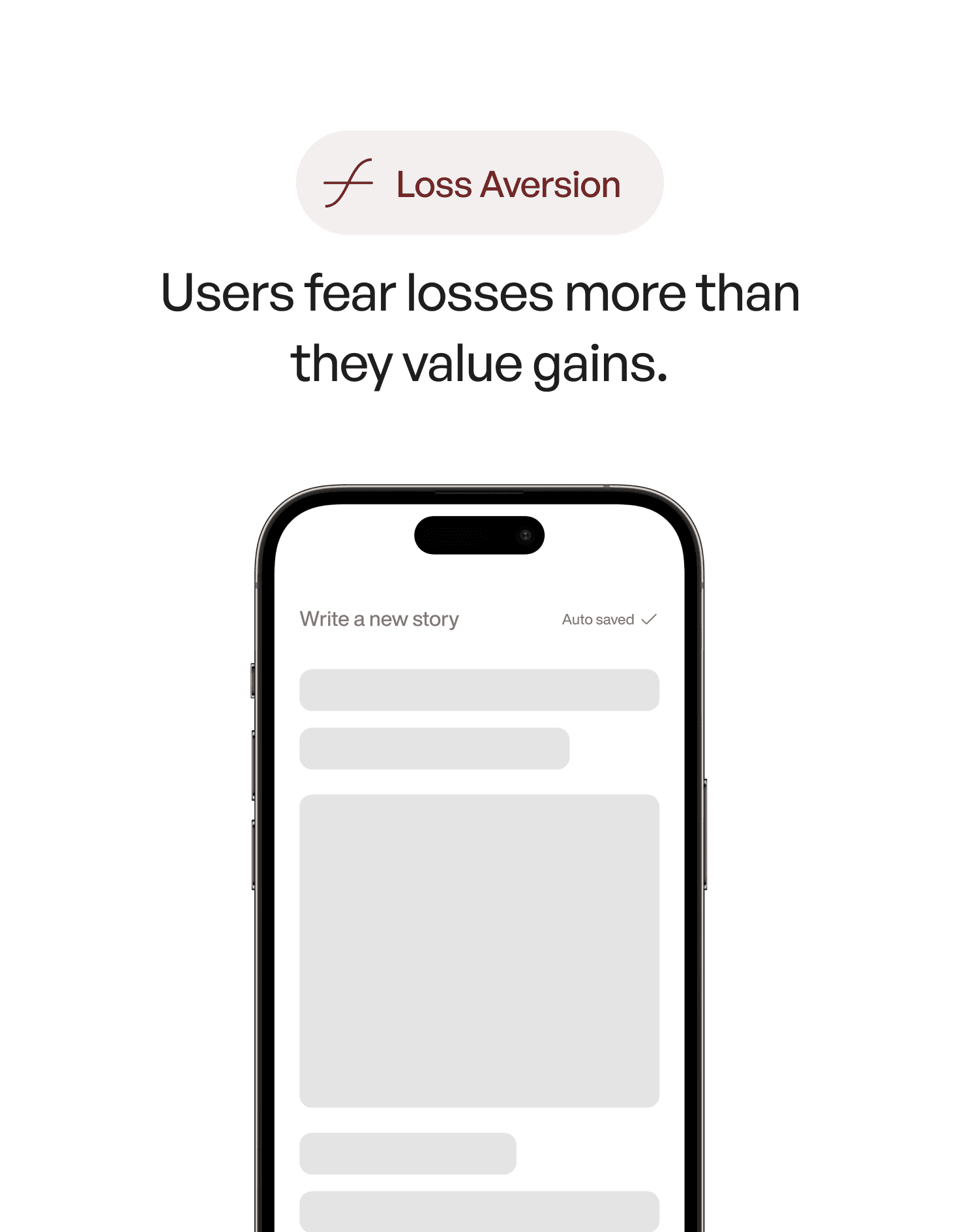
2. Onboarding Flows
💥 Problem: Too much friction early can feel like a waste of effort.
✅ Design Fix:
Save user progress (auto-draft, auto-save)
Acknowledge time invested (“Just one step left”)
Let users preview benefits before full commitment
3. Delete, Exit, or Navigation Actions
💥 Problem: Users avoid irreversible actions.
✅ Design Fix:
Use confirmations with emotional copy (“Are you sure you want to delete this?”)
Offer undo buttons or temporary recovery states
Show what's at risk before they exit a flow
💬 Reassurance is the antidote to loss aversion.
🎯 Design Tips for Managing Loss Aversion
Frame choices around what users will lose
→ “Don’t miss your chance to save” works better than “Save now”Use scarcity carefully
→ “Only 3 spots left” works, but don’t fake urgencyLet users feel in control
→ Undo, autosave, and preview options reduce anxietyReassure before commitment
→ Show benefits early, and make the outcome clear before action
🎨 Real-World Example
🧪 Before:
A subscription cancels instantly — no feedback, no confirmation.
✅ After:
A dialog appears: “You’ll lose access to your files. Your plan ends in 5 days. Want to pause instead?”
Result? Fewer cancellations, more paused accounts.
📘 Want to Master Biases Like This?
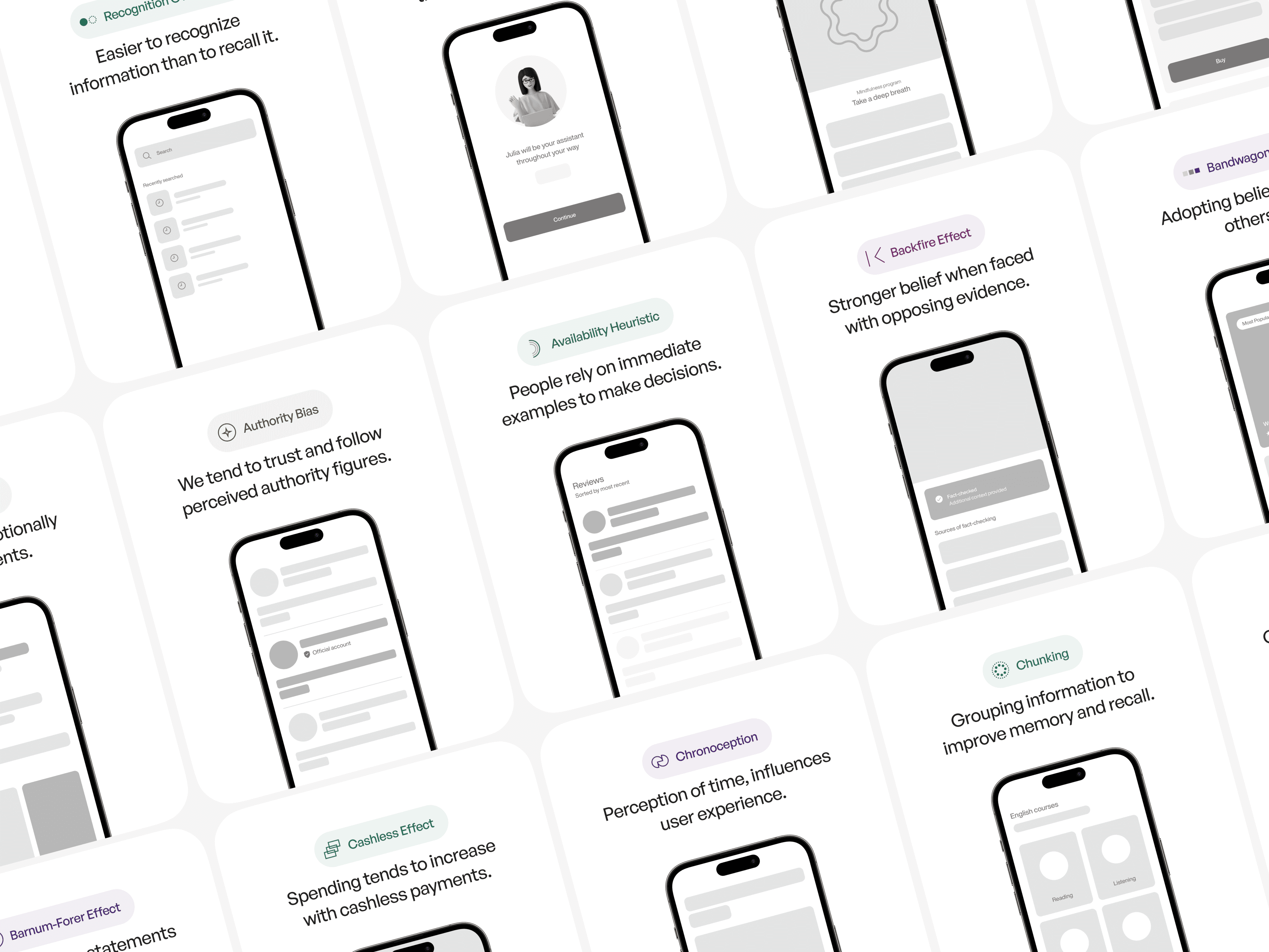
User Psychology 3 is a comprehensive ebook that helps designers apply psychology directly to UI and product design.
Inside you’ll find:
100+ cognitive principles (like loss aversion, anchoring, Hick’s Law)
Visual examples and patterns
Practical ways to apply each principle
Mistakes to avoid