Hick’s Law in UX: Why Fewer Choices Drive Better Design

The more options you give users, the longer they take to decide — and the more likely they are to give up altogether.
This is the core of Hick’s Law, a foundational psychology principle every UX designer should know.
If your interface overwhelms users with choices, even unintentionally, you’re adding friction. But when you reduce cognitive effort, users move faster, with more confidence.
Let’s break it down.
🧠 What Is Hick’s Law?
Hick’s Law (also called Hick–Hyman Law) states that the time it takes to make a decision increases with the number and complexity of choices.
More options = more mental processing = slower (or no) action.
💬 In UX, every extra choice adds friction — even if it feels helpful.
🧭 Why Hick’s Law Matters in UX Design
Users don’t want all the options — they want the right ones.
When faced with too many buttons, filters, settings, or links:
They hesitate
They feel overwhelmed
They abandon the task
Hick’s Law helps you design flows that feel effortless — not exhausting.

✅ How to Apply Hick’s Law in UX
1. Limit Choices on Primary Screens
→ Don’t show every filter at once
→ Collapse secondary settings by default
→ Use progressive disclosure (reveal more as needed)
2. Prioritize Clear Paths
→ Highlight the most important CTA
→ De-emphasize secondary or optional actions
→ Use visual hierarchy to guide decision-making
💬 Clarity reduces hesitation. So does contrast.
3. Group Related Options
→ Use categories or tabs to chunk choices
→ Visually separate different levels of decision-making
→ Help users process faster by reducing visual clutter
4. Use Defaults Thoughtfully
→ Pre-select common or smart defaults
→ Let users move forward with minimal effort
→ Avoid blank slates — make the first move easy
5. Keep Navigation Focused
→ Avoid 10-item nav menus
→ Prioritize the most-used destinations
→ Use clear labels, not clever ones
🎨 Real Example
🔻 Before: A pricing page with 6 plans, all equally styled
✅ After: 3 options, with one clearly marked “Recommended”
Result? Faster decisions, higher conversion.
✨ Bonus Tip: Hick’s Law + Emotion
Too many options don’t just slow users down — they make users feel anxious.
Design is emotional, and simplicity = safety.
By reducing choices, you’re not limiting freedom — you’re reducing pressure.
📘 Want to Master UX Psychology?
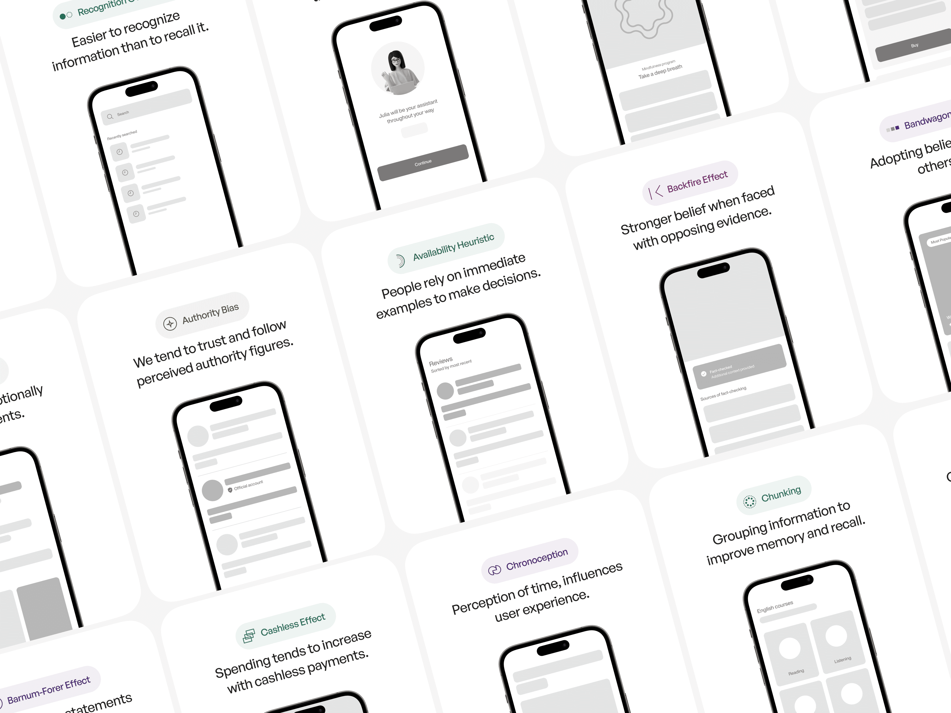
User Psychology 3 is a designer-friendly ebook that covers:
100+ psychology principles like Hick’s Law, loss aversion, and the Peak-End Rule
UI examples
Common mistakes to avoid
Visual breakdowns of what works and why
If you design products for people, you need to understand how people think.