The Halo Effect in UX Design: How Visuals Shape User Trust

💭 Intro
Have you ever loved an app just because it looked good from the start?
That’s not logic — that’s psychology.
The Halo Effect is a powerful cognitive bias where our first impression of one trait (like aesthetics) influences how we perceive everything else. In UX, this can be the difference between trust and doubt, love and bounce.
Let’s explore how to design first impressions that radiate into the rest of the user experience.
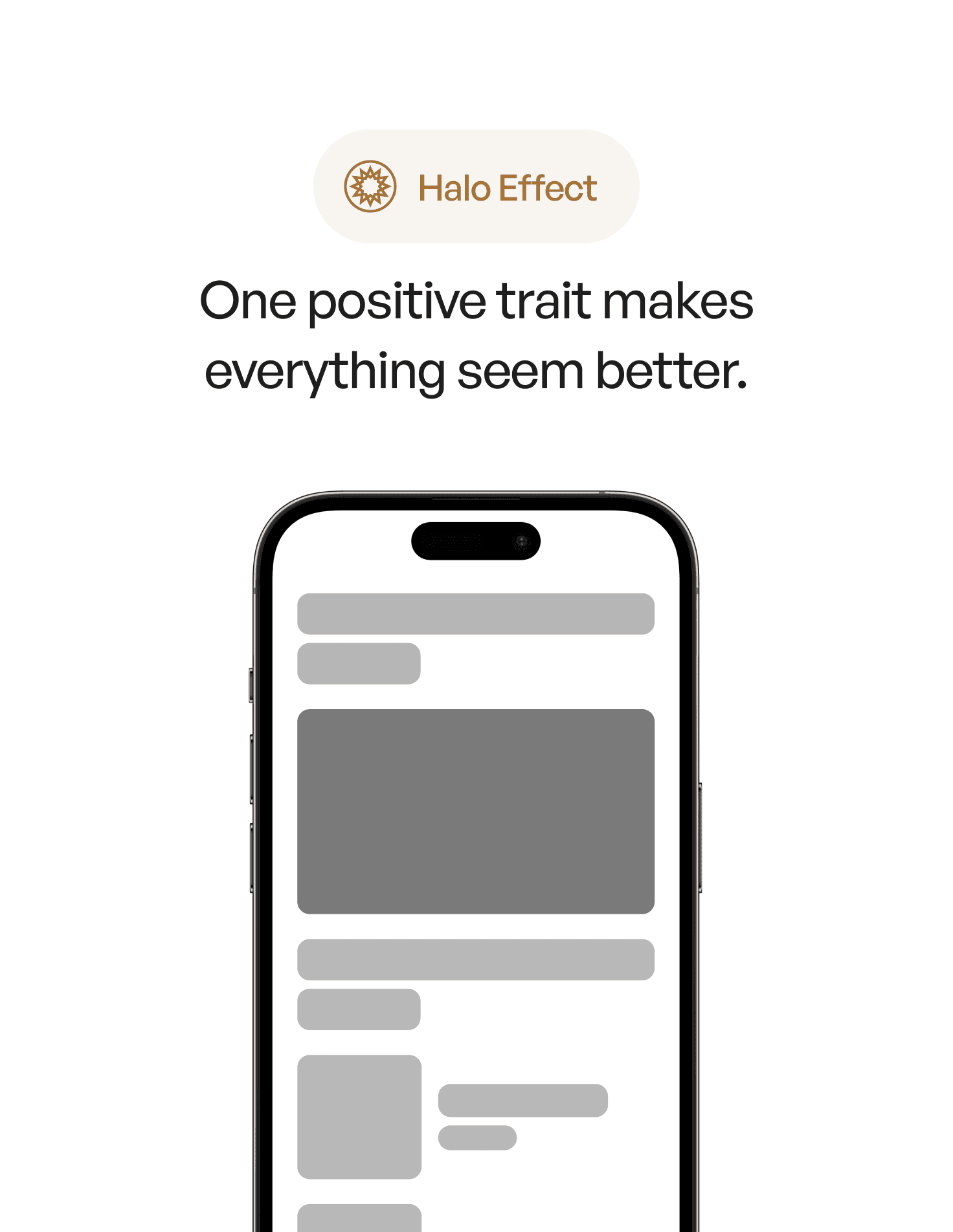
📘 What is the Halo Effect?
The Halo Effect is a cognitive bias where our judgment of one positive trait leads us to assume other positive qualities — even without evidence.
In other words, if something looks good, we assume it works well too.
This is why users often equate beautiful design with credibility, trust, and usability — whether it’s true or not.
🔍 Why It Matters in UX
In product design, the first few seconds shape perception:
A sleek landing page makes your startup feel “premium”
A pixel-perfect form earns trust before the user even types
An off-brand or clunky layout makes users hesitate, even if your product is great
The Halo Effect teaches us that visuals aren’t just decoration — they’re signals. And they affect everything that comes after.
🛠 How to Apply the Halo Effect in UX
Here are 5 practical ways to harness the Halo Effect:
Design a strong first screen. Whether it's onboarding, a homepage, or a loading state — make it visually polished and emotionally clear.
Use microinteractions. Small, smooth animations make the product feel responsive and thoughtful.
Elevate visual hierarchy. Clear typography, spacing, and contrast show care — and care builds trust.
Polish empty states and loading screens. These are often overlooked, but users judge you there too.
Be consistent. Inconsistency creates friction. Visual and behavioral alignment builds the Halo.
Good UX starts before functionality. It starts with perception.
🧠 Real-World Example
Think of Notion.
From the moment you land on their site — clean visuals, calm motion, minimalist aesthetic — you feel that this is a thoughtful, premium tool.
That first impression colors everything: performance, features, even the pricing feels more justified. The Halo is working.
⚖️ Bonus Tip: Don’t Fake It
Yes, good visuals matter — but they can’t cover a broken experience forever.
The Halo Effect is a head start, not a substitute. Make sure what comes after lives up to the first impression.
📗 Want to master 100+ principles like this?
User Psychology 3 is a curated ebook for designers who want to craft intuitive, emotionally intelligent products.
From visual biases like the Halo Effect to decision-making traps like the Sunk Cost Fallacy — it’s packed with real-world examples and practical UX applications.