Framing in UX Design: How Presentation Shapes Perception & User Decisions

Some screens don’t change the information —
they change how the information feels.
Two options with the same meaning can lead to completely different decisions depending on how they’re presented.
This subtle shift — this psychological lens — is called framing.
And it’s one of the most influential persuasion tools in UX design.
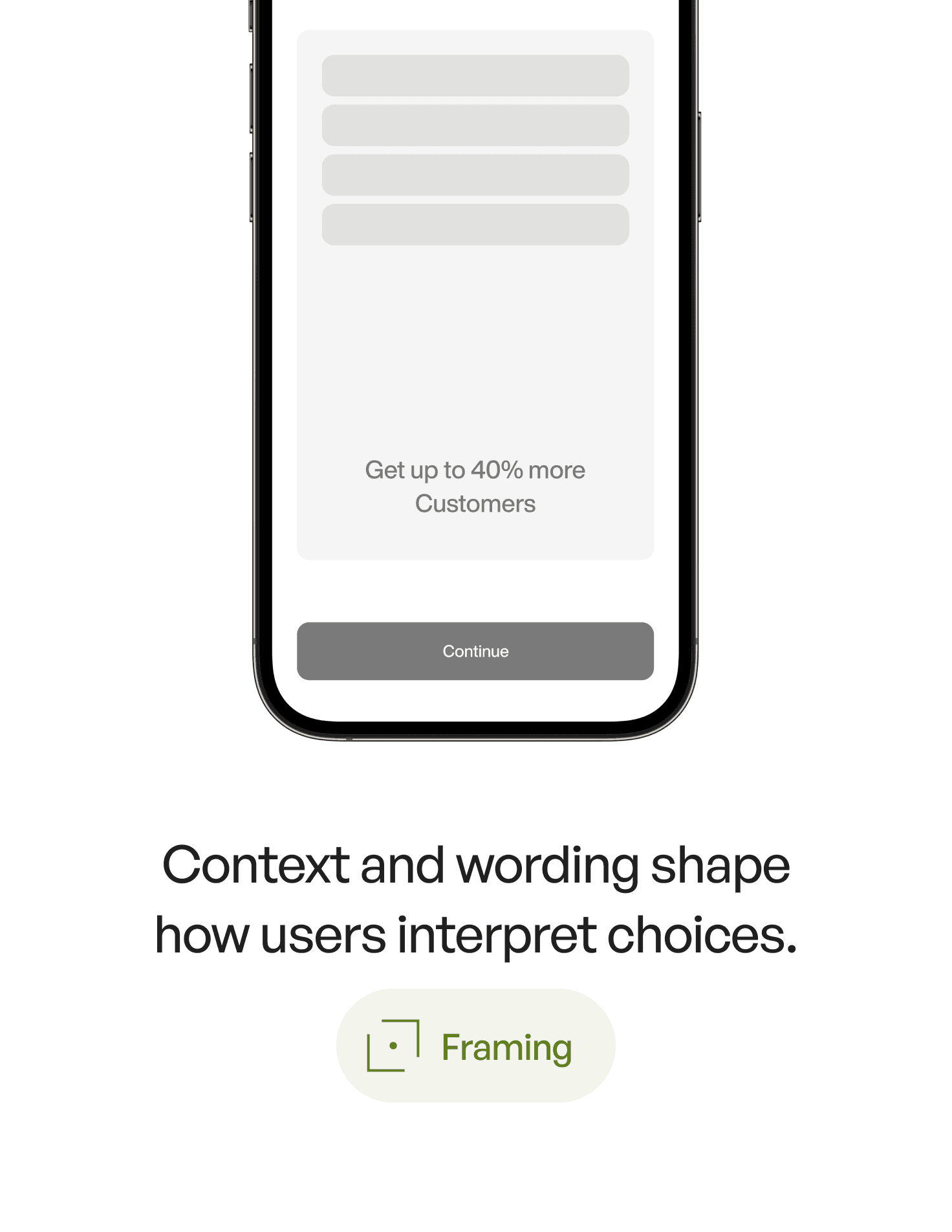
1. What Is Framing? (Definition)
Framing is a psychology principle where the way information is presented changes how users interpret and respond to it, even when the underlying information is identical.
For example:
“Save 20%”
vs.“Don’t lose 20%”
Same math.
Different behavior.
Framing shapes perception, emotion, and decision-making — often more than the actual content.
2. The Psychology Behind It
Framing works because the human mind:
1. Reacts emotionally before reasoning
A message framed negatively (“You’ll lose your progress”) feels more urgent than one framed positively (“Keep your progress”).
2. Relies on mental shortcuts
Users don’t calculate.
They feel which option is safer, smarter, or more rewarding.
3. Hates loss more than it values gain
Loss aversion makes negative framing highly persuasive.
4. Wants clarity
Clear, crisp framing reduces cognitive load and uncertainty.
In UX, framing doesn’t manipulate — it guides the user toward clarity, reducing friction when making decisions.
3. Why Framing Matters in UX Design
Because every interaction includes a micro-decision:
Should I sign up?
Should I upgrade?
Should I confirm this step?
Should I allow notifications?
Should I complete this profile?
Framing can increase:
onboarding completion
subscription conversion
plan selection clarity
form submission rates
opt-in acceptance
perceived value of features
trust and emotional comfort
Framing is not about changing the truth — it's about expressing it in a way that matches how humans naturally think.
4. Real-World Example
Imagine a subscription upgrade screen:
Version A
“Your current plan has limits.”
Version B
“Unlock the full experience enjoyed by 87,000 designers.”
Version C
“Don’t miss out — upgrade now to keep unlimited access.”
Same offer.
Three frames.
Three emotions:
A → Neutral, unclear.
B → Social proof framing.
C → Loss-avoidance framing.
Framing doesn’t change the content —
it changes how the content touches the user’s mind.
5. Common Mistakes (And How to Avoid Them)
❌ Mistake 1: Presenting information “flat”
Designers often state facts without intention.
Fix:
Ask: What emotion should this evoke?
Clarity? Urgency? Confidence?
❌ Mistake 2: Using fear framing excessively
Fear works, but too much feels manipulative.
Fix:
Balance negative and positive frames.
❌ Mistake 3: Framing options equally
If both buttons look the same, users hesitate.
Fix:
Frame the recommended action with stronger clarity and hierarchy.
❌ Mistake 4: Ignoring cultural context
Some markets respond better to positive framing; others to avoidance framing.
Fix:
Test your frames — but test emotionally, not analytically.
❌ Mistake 5: Trying to “trick” the user
Short-term gains → long-term distrust.
Fix:
Use framing to clarify, not deceive.
6. How to Apply Framing in Your Designs (Practical Tips)
1. Highlight gains for long-term actions
Users respond well to benefit framing for complex, multi-step processes.
2. Highlight losses for missed opportunities
Limited access, limited features, expiring actions.
3. Use “default framing” to guide choices
“Recommended” plans reduce mental effort.
4. Frame decisions around user identity
“Designed for serious creators.”
“Trusted by professional agents.”
Identity is a powerful frame.
5. Frame the why, not just the what
“Complete your profile → get better matches”
meaningfully beats:
“Complete your profile.”
6. Frame options asymmetrically
Make the best option easy to justify emotionally.
7. Key Takeaways
Framing shapes how users interpret the same information
Loss aversion makes “avoid losing” frames powerful
Benefit framing works for complex or long-term actions
Good framing reduces cognitive effort and speeds up decision-making
The best framing clarifies, not manipulates
📘 Want to Go Deeper Into Design Psychology?
If you want 60+ psychology principles with examples, visuals, and detailed breakdowns of how to use them in real products, explore
User Psychology 3 — the handbook designers keep on their desk.