Experimenting with the new design language.

Design language is not just a set of components or rules, but a way of thinking. A shared intuition. A sense of what feels right and what doesn’t. It's a culture. It behaves less like a system and more like a set of shared instincts.
New design language principles
Three ideas keep showing up in how we make decisions:
Inherent
Harmonious
Consistent
They’re not rules. They’re more like a baseline for what feels right.
1. Inherent
Letting content define the interface
The first principle is about being honest with what the interface represents.
Instead of starting with predefined structures—cards, containers, neutral layouts—we start with the content itself.
What is this screen actually about?
If it’s a product, the product should shape the screen.
If it’s weather, the atmosphere should be felt.
If it’s time, the interface should reflect that.
The goal is not to decorate the interface, but to let the content express itself more directly.
2. Harmonious
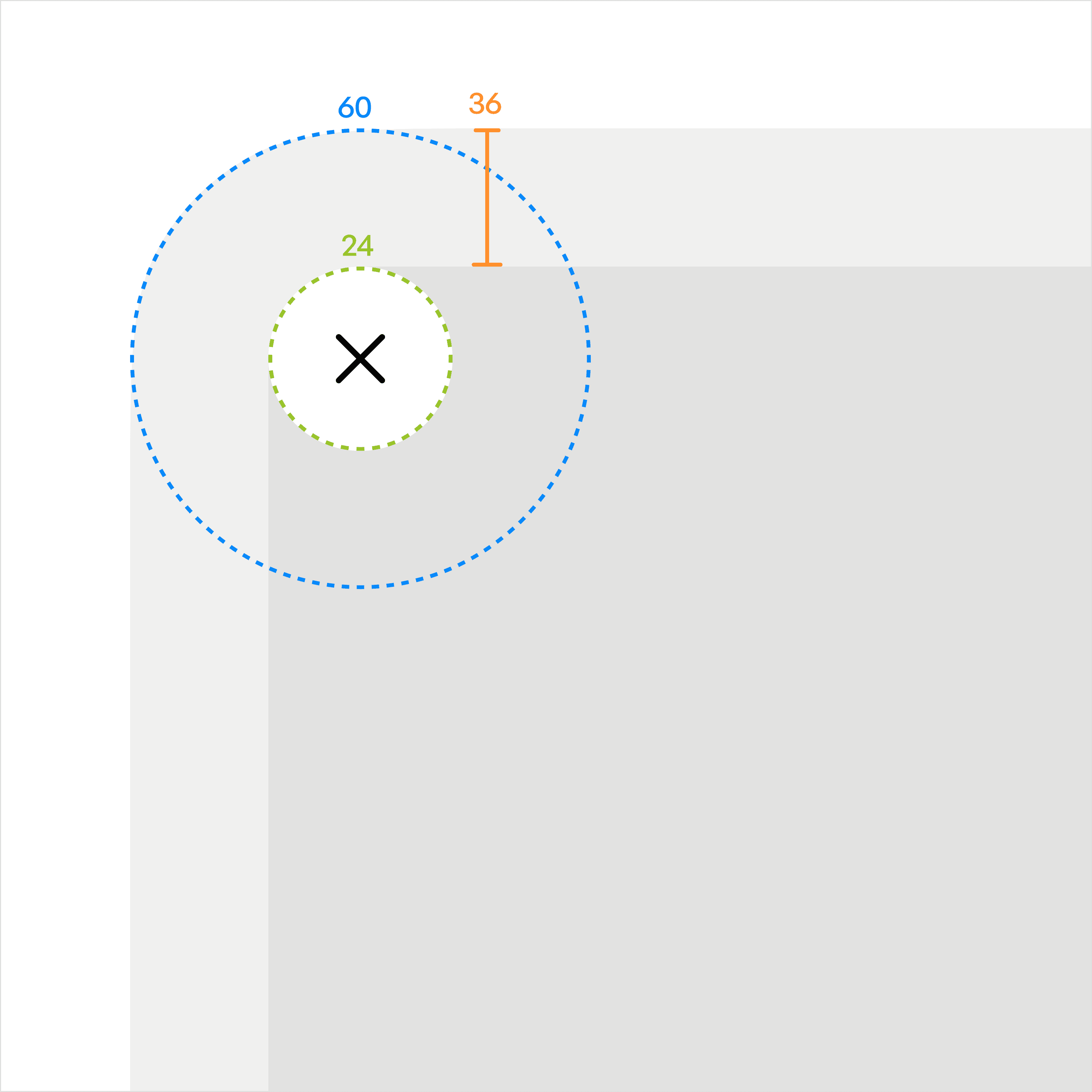
An informed relationship between digital or even physical elements.
spacing
proportion
alignment
shape
This is where attention to detail matters most.
Not as decoration, but as structure.
3. Consistent
Making things reliable
Consistency is still essential, but not as visual sameness.
It’s about logic.
Things should behave in ways that are predictable and easy to understand. Patterns should feel familiar.
This is where the design system continues to play its role.
As the surface becomes more flexible, the underlying structure needs to remain stable.
Consistency is what makes the whole experience trustworthy.
How they work together
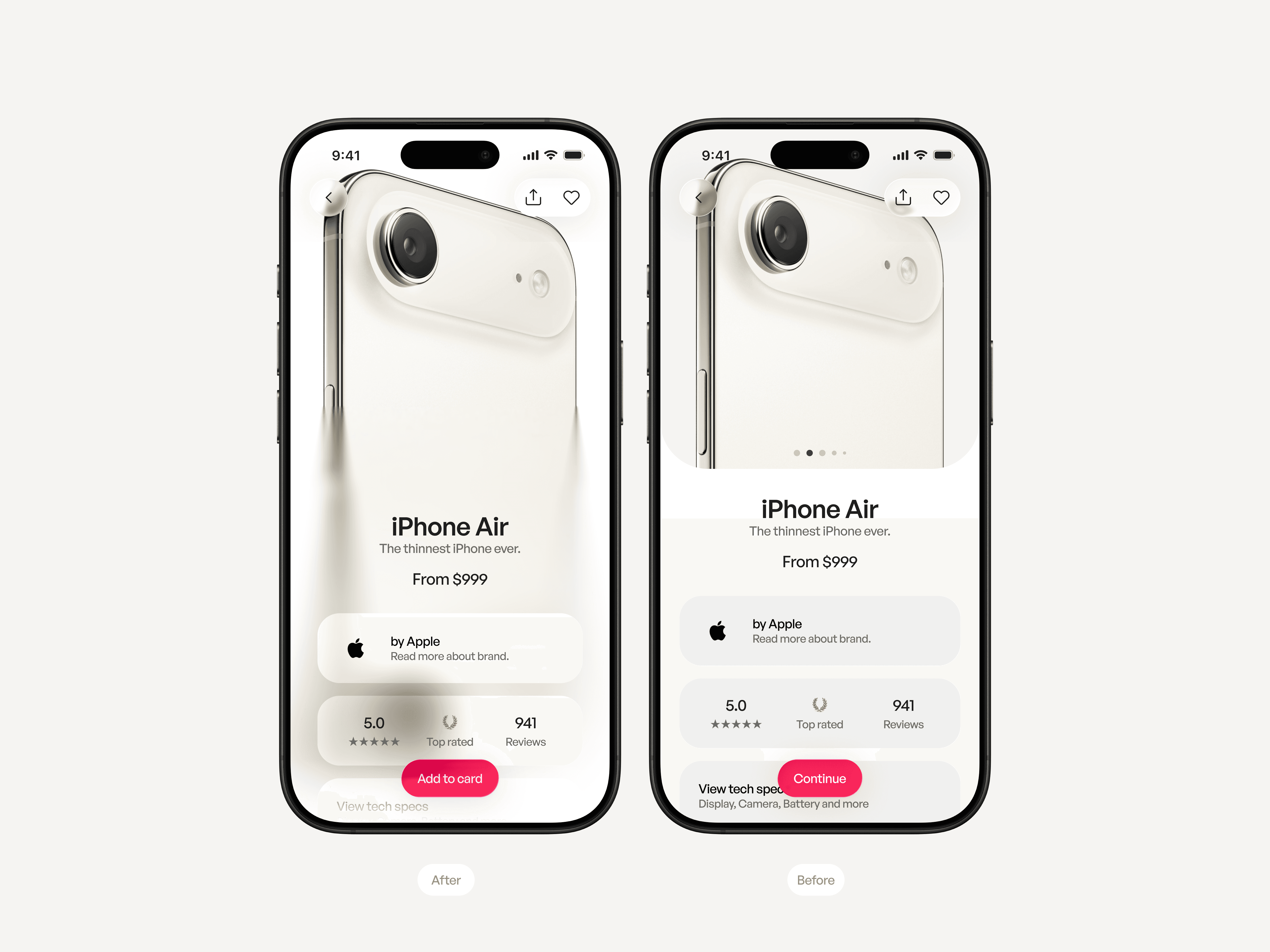
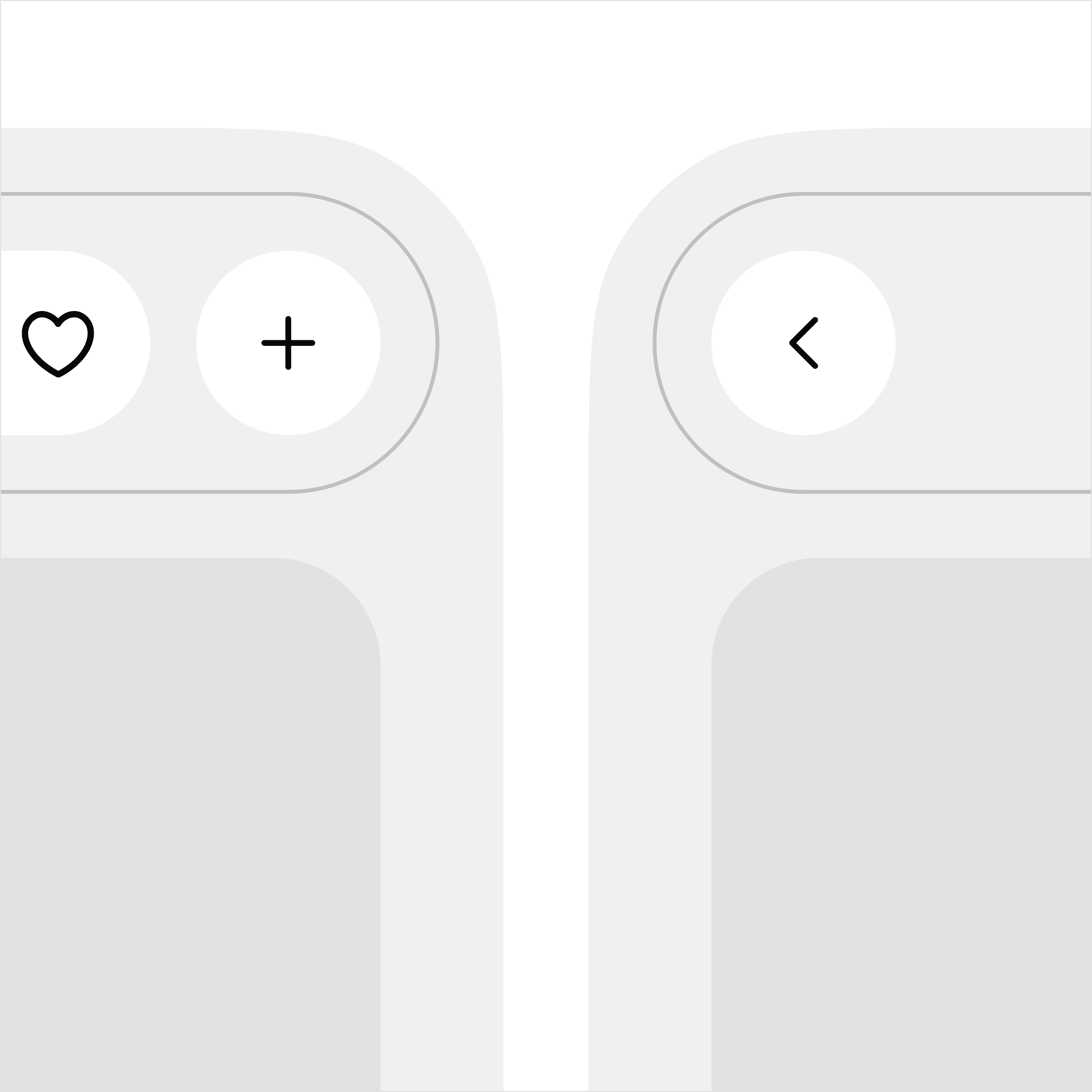
Instead of placing the product inside a structured layout, the product defines the entire screen. The background is derived directly from the product imagery, allowing the interface to feel more connected to what is being presented rather than acting as a neutral container.
The UI elements step back visually and act more as overlays than frames. This shifts the focus away from the system itself and toward the product, making the experience feel less like browsing a template and more like engaging with the product directly.
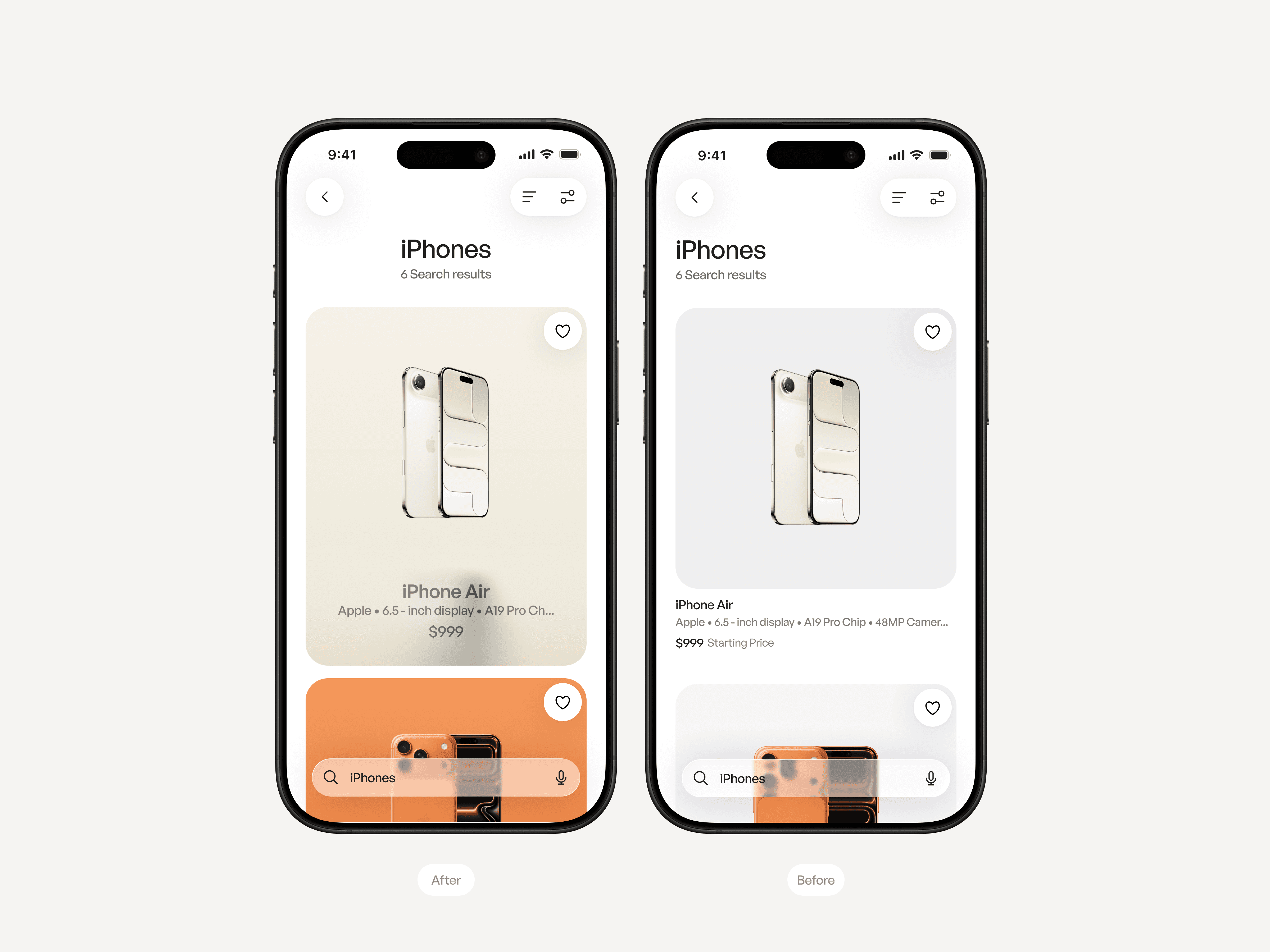
The list is no longer treated as a grid of isolated cards. Each item begins to feel more integrated into the overall surface, with reduced separation and a stronger relationship between content and layout.
The interface still maintains structure for scanning, but avoids over-framing each item. This allows the products to stand out individually while still feeling part of a continuous flow, rather than a collection of repeated components.
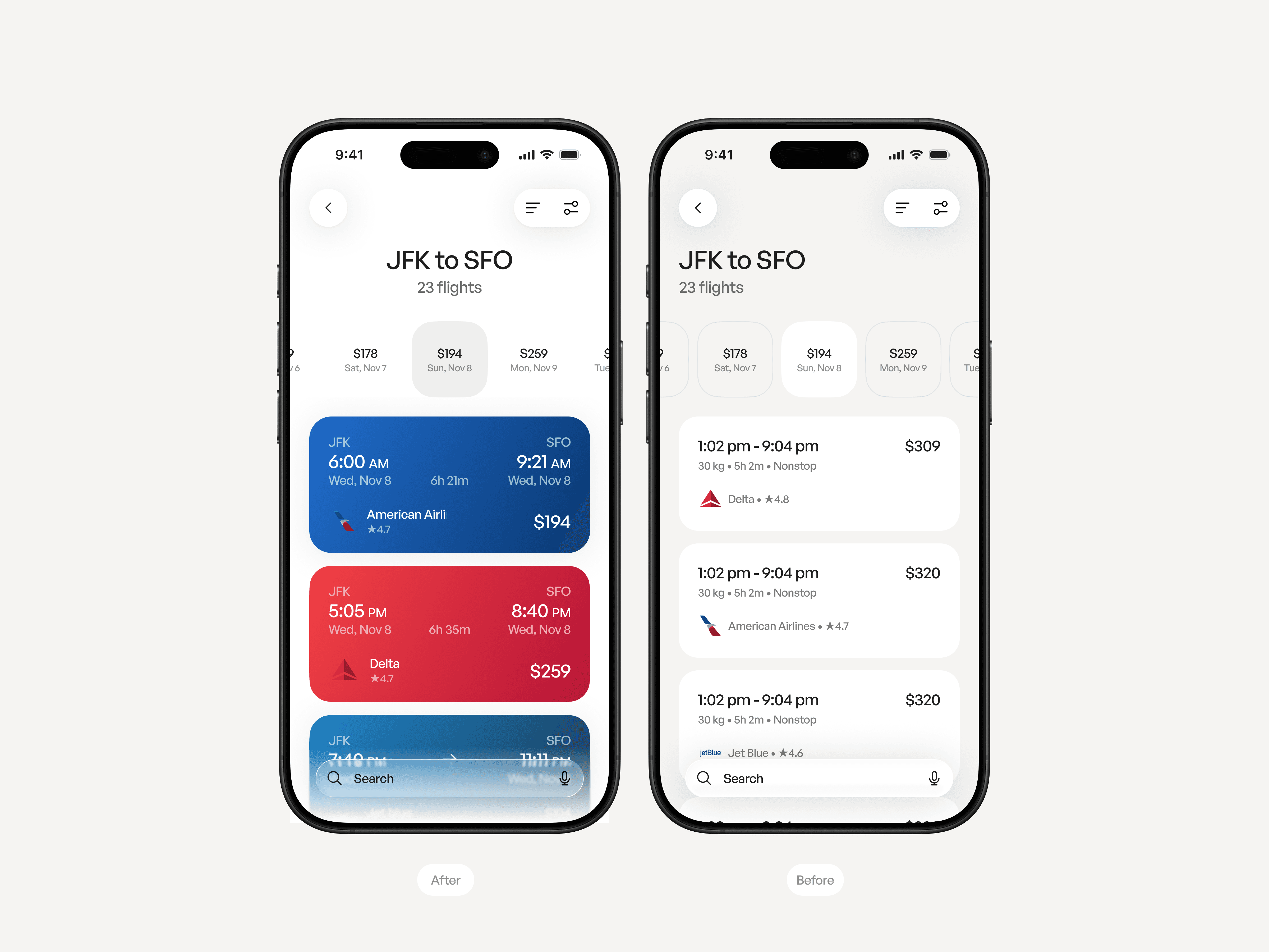
The layout balances clarity with a stronger sense of context. Each card inherits the Airline branding color and resemble a ticket.
Search results remain easy to scan and compare, The system provides structure, while the content gives the screen its character.
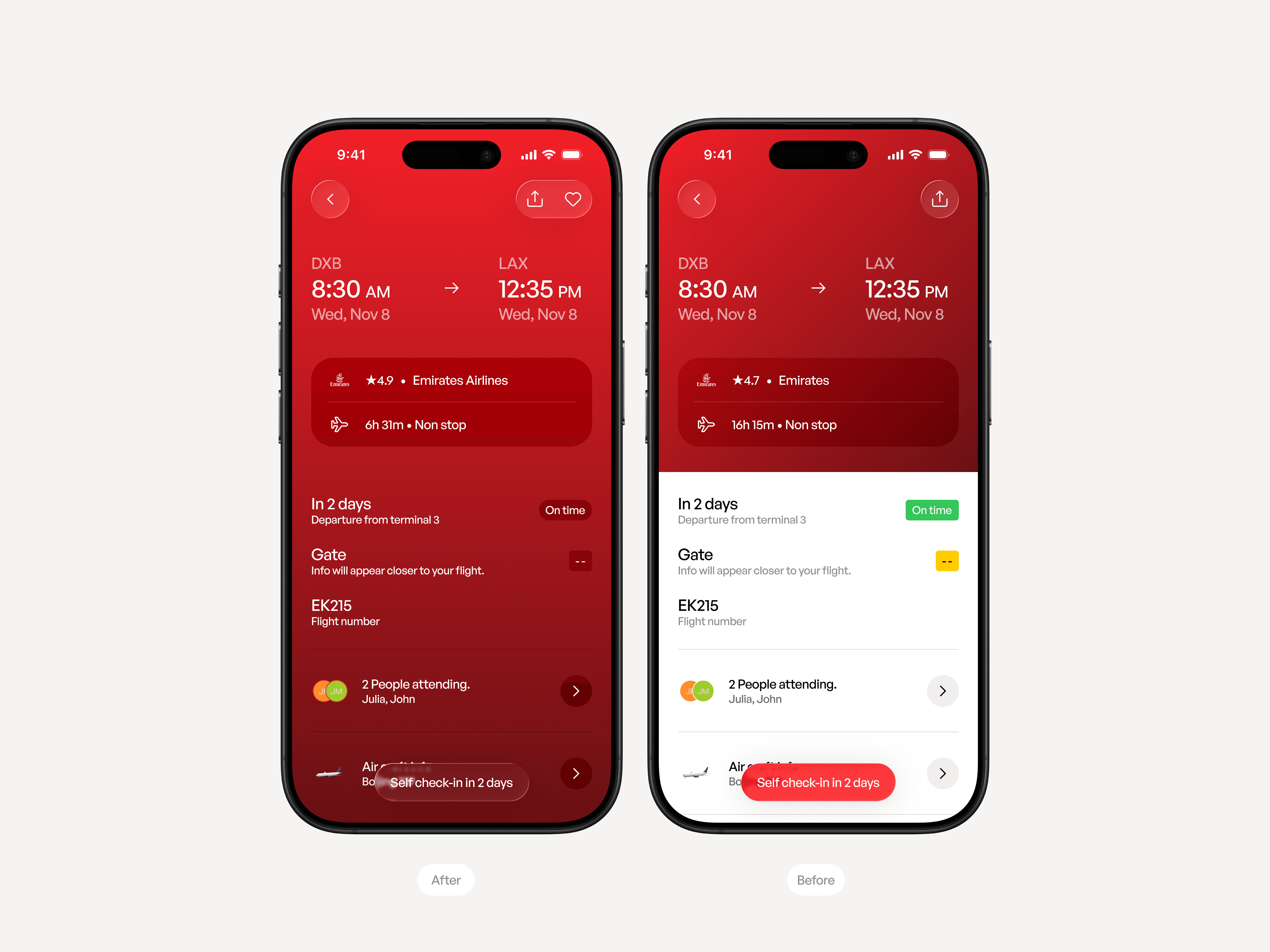
The interface takes its color directly from the airline’s branding, making the screen feel tied to the specific journey rather than generic. Feels like the ticket expanded and expressed itself. The system provides structure, while the airline defines the atmosphere.