Design Tokens 101: Create Consistent, Scalable UI Systems
May 23, 2025
💭 Intro
Every design team wants consistency. Every dev team wants flexibility. And every product needs to scale without breaking its visual language.
Design tokens make all of that possible.
They’re small, invisible pieces of a design system that power big, visible outcomes — like clean interfaces, smooth handoff, and effortless theming. If you’re building a design system (or using one), understanding tokens isn’t optional — it’s essential.
📘 What Are Design Tokens?
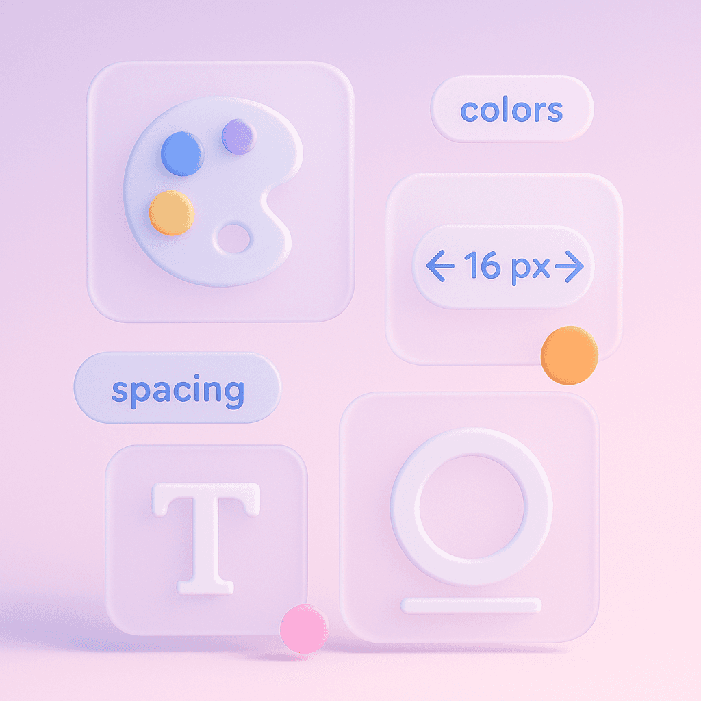
Design tokens are the foundational variables of a design system. Think of them as the raw ingredients behind the visual recipe — stored values for:
🎨 Colors (
color-primary)📐 Spacing (
spacing-md)🔤 Typography (
font-size-sm)🧩 Radii, shadows, borders, breakpoints, motion, and more
They’re used across design and code to create consistency across platforms. Update the token, and every instance updates — no search and replace needed.

🔍 Why Design Tokens Matter in UX
Without tokens, your UI becomes fragile.
Designers change one thing, developers guess the rest, and suddenly your product has five kinds of grey.
Tokens solve this by creating a single source of visual truth:
Keep style consistent across platforms
Enable light/dark mode with one theme switch
Reduce handoff friction between design and code
Let teams scale UI confidently
They’re not just helpful — they’re what make scalable design possible.
🛠 How to Use Design Tokens Effectively
Here’s what we’ve learned building Design System 2 — and how you can apply the same thinking:
Name tokens by purpose, not value. Use
color-text-error, notred-500. This keeps tokens semantic and swappable.Group tokens into themes. Light, dark, glass — create token sets that can be applied system-wide.
Tokenize everything. From spacing and radii to elevation and motion — the more you tokenize, the more flexible your system becomes.
Use tools to stay in sync. Tools like Tokens Studio and Style Dictionary keep tokens connected between Figma and code.
Test across screens. Tokens should behave predictably on every viewport — test them like components.
🧠 Real-World Example: Inside Design System 2
In Design System 2, tokens are everywhere — powering colors, sizes, shadows, and states. But here’s the real magic:
You can switch entire themes (light, dark, or translucent “Material” mode) just by changing token sets
All components — buttons, cards, inputs — update instantly with no manual override
Tokens are clean, readable, and built for developers and designers
⚖️ Bonus Tip: Start with a core set
Too many teams go wild creating 200 tokens at once.
Start small. Build a foundational set of 40–60 core tokens. Expand as your system grows. Simplicity scales.
📗 Want a design system that’s already tokenized?
Design System 2 is built from the ground up with a thoughtful token architecture.
You get clarity, speed, and total customization — without breaking anything. Designers stay in flow. Developers stay sane.
2025 Sigma. All rights reserved. Created with hope, love and fury by Ameer Omidvar.