Design Tokens in UX: Create Consistent, Scalable UI Systems
May 22, 2025
💭 Intro
Design systems often break down not because they’re badly made — but because they don’t scale well.
One change to a color, and suddenly five buttons are off. One tweak to spacing, and layouts fall apart. That’s where design tokens come in.
They’re the invisible glue behind visual consistency, and the secret to making a design system feel effortless across teams, devices, and time.
📘 What Are Design Tokens?
Design tokens are the smallest pieces of your design system — stored as variables.
They represent values like:
Colors (e.g.
--color-primary: #FF3B3B)Typography (e.g.
--font-size-sm: 14px)Spacing (e.g.
--space-md: 16px)Shadows, borders, radii, breakpoints...
Instead of hardcoding styles, tokens give you a single source of truth that can be updated in one place and reflected everywhere.
🔍 Why They Matter in UX Design
Tokens bring consistency, scalability, and developer collaboration to your design system.
Here’s what they unlock:
Design that adapts across themes, devices, and platforms
Faster handoff from Figma to code
Easy updates without breaking UI
Clear alignment between design and engineering
Most importantly: they reduce the cost of change — and in product design, change is constant.
🛠 How to Use Design Tokens Effectively
Here are 5 tips we’ve learned building Design System 2:
Start with naming conventions. Use a clear, scalable structure (e.g.
color-bg-surface-light,radius-sm). Consistency here avoids chaos later.Group by role, not raw value. Think
color-text-error, not justred-600. It makes them easier to swap without rethinking intent.Build themes with tokens. Light and dark modes? Brand variations? Use token sets for each. Swap them at runtime or build time.
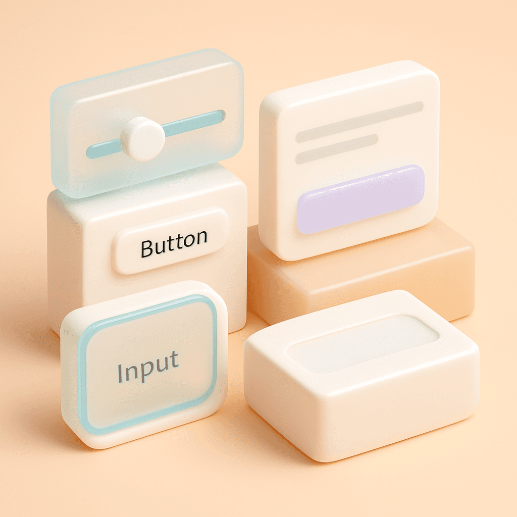
Use them everywhere. Don’t just stop at color. Elevation, spacing, borders — every visual decision should be tokenized.
Sync design and dev. Use tools like Style Dictionary or Tokens Studio for Figma to keep tokens consistent across environments.
Tokens are not just for engineers. They’re for everyone who touches the interface.
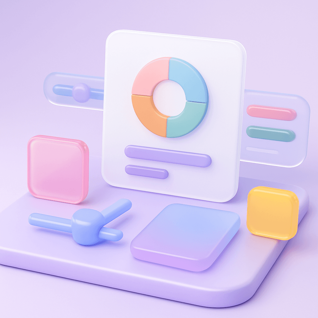
🧠 Real-World Example: How We Built It in Sigma
In Design System 2, every component is built on top of a deep token layer.
Colors, shadows, radii — all adjustable with tokens
Toggle between Light, Dark, and “Material” mode via token switching
Build spatial interfaces with translucent layers using glass-mode tokens
This means you can customize the entire system without touching the components themselves.
⚖️ Bonus Tip: Don’t Go Overboard
Tokens add structure — but too many can become unmanageable.
Avoid token bloat. Build what you need. Refactor often. Remember: simplicity scales better than abstraction.
📗 Want a design system that’s already tokenized?
Design System 2 is built from the ground up with a smart token architecture.
You get the flexibility of deep customization — with the simplicity of plug-and-play components.
No need to reinvent variables. Just start designing.