Design System documentation best practices

1. Introduction
Design systems often fail not because of incomplete components, but because of incomplete understanding.
Documentation bridges that gap. It translates visual design into shared logic — explaining not just what exists, but why.
When documentation is inconsistent or shallow, teams revert to local solutions, fragmenting the system’s coherence. When done well, it accelerates onboarding, decision-making, and long-term maintainability.
This article examines several notable documentation models — including those from Apple, Atlassian, Material, eBay, and Sigma — to identify structural and stylistic qualities that make design system documentation effective.
2. The Role of Documentation in a Design System
Documentation is the interpretive layer of a design system.
It defines the intent behind components, prescribes their usage, and ensures continuity across design and engineering disciplines.
Effective documentation typically:
Establishes a predictable and navigable structure.
Balances prescriptive guidance with contextual reasoning.
Integrates live examples rather than static references.
Uses language that is neutral, precise, and task-oriented.
3. Comparative Documentation Models
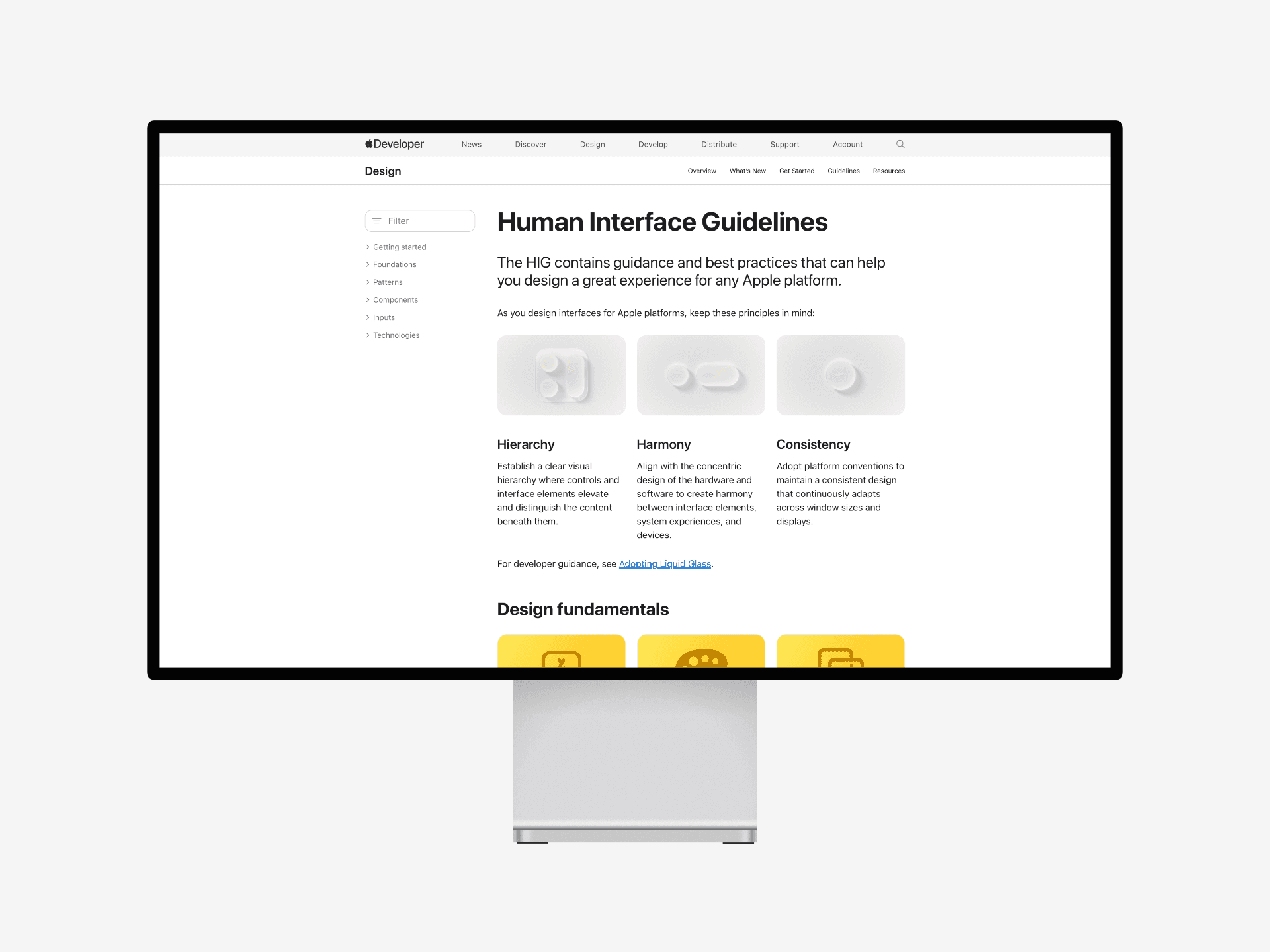
Apple Human Interface Guidelines
Apple’s HIG remains the benchmark for clarity and organization. Each entry follows a logical progression — principle → rationale → pattern → example — presenting both philosophy and application. The tone is formal and instructive, prioritizing design reasoning over stylistic preference.

Atlassian Design System
Atlassian’s documentation emphasizes collaboration. It merges visual and textual guidance with practical code references, making it accessible to both designers and engineers. Each page encourages understanding through context rather than isolated instruction.
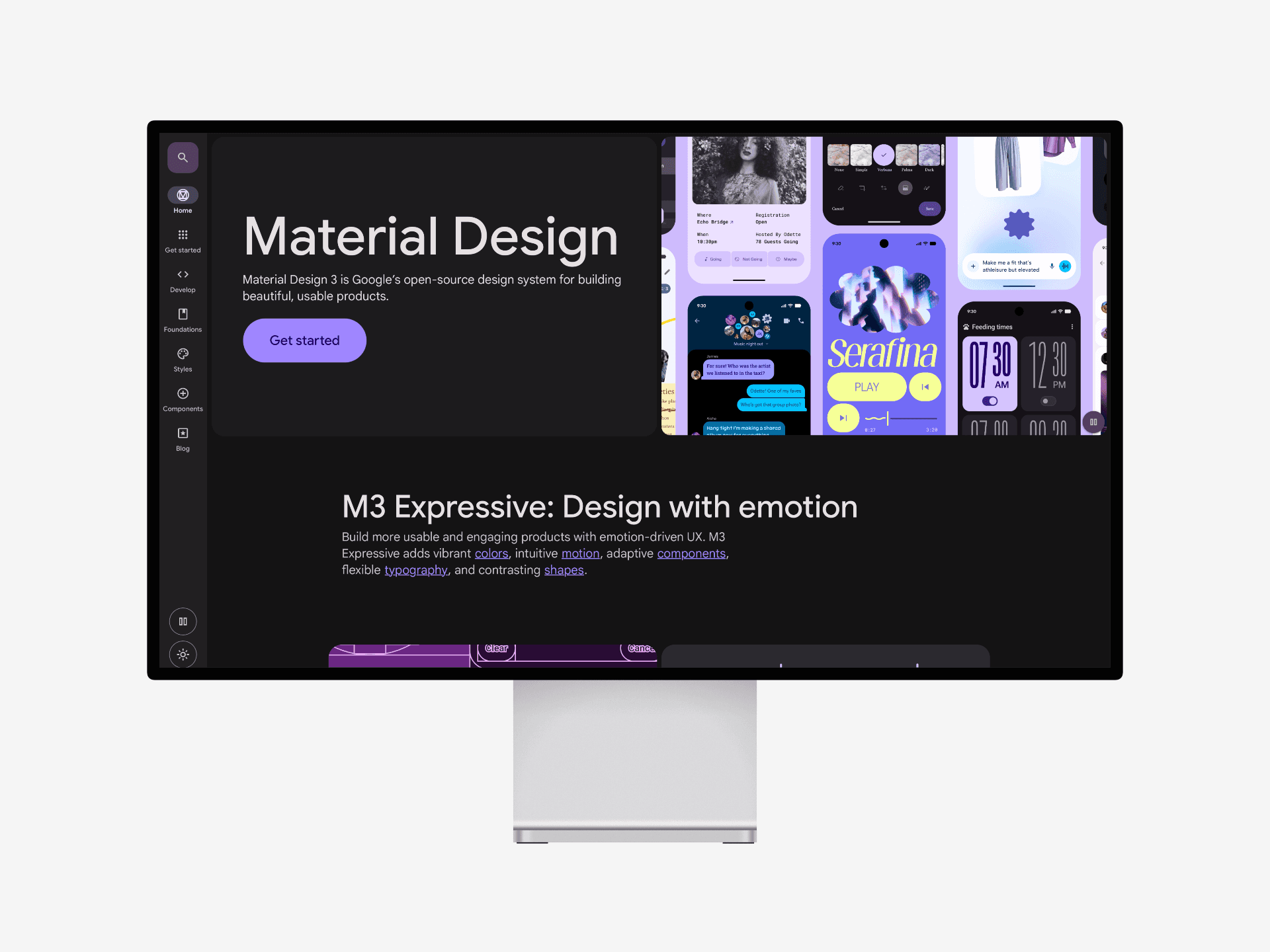
Material Design
Material’s documentation exemplifies interactive teaching. By embedding animation and state transitions, it illustrates principles of movement, hierarchy, and feedback. Interaction becomes a learning tool rather than an afterthought.

eBay Playbook
eBay’s Design Playbook stands out for its practical orientation and direct language. It connects design guidelines with measurable outcomes, focusing on accessibility, scalability, and localization. The Playbook treats documentation as an evolving dialogue between disciplines — emphasizing clarity, internal consistency, and cultural adaptability across global teams.
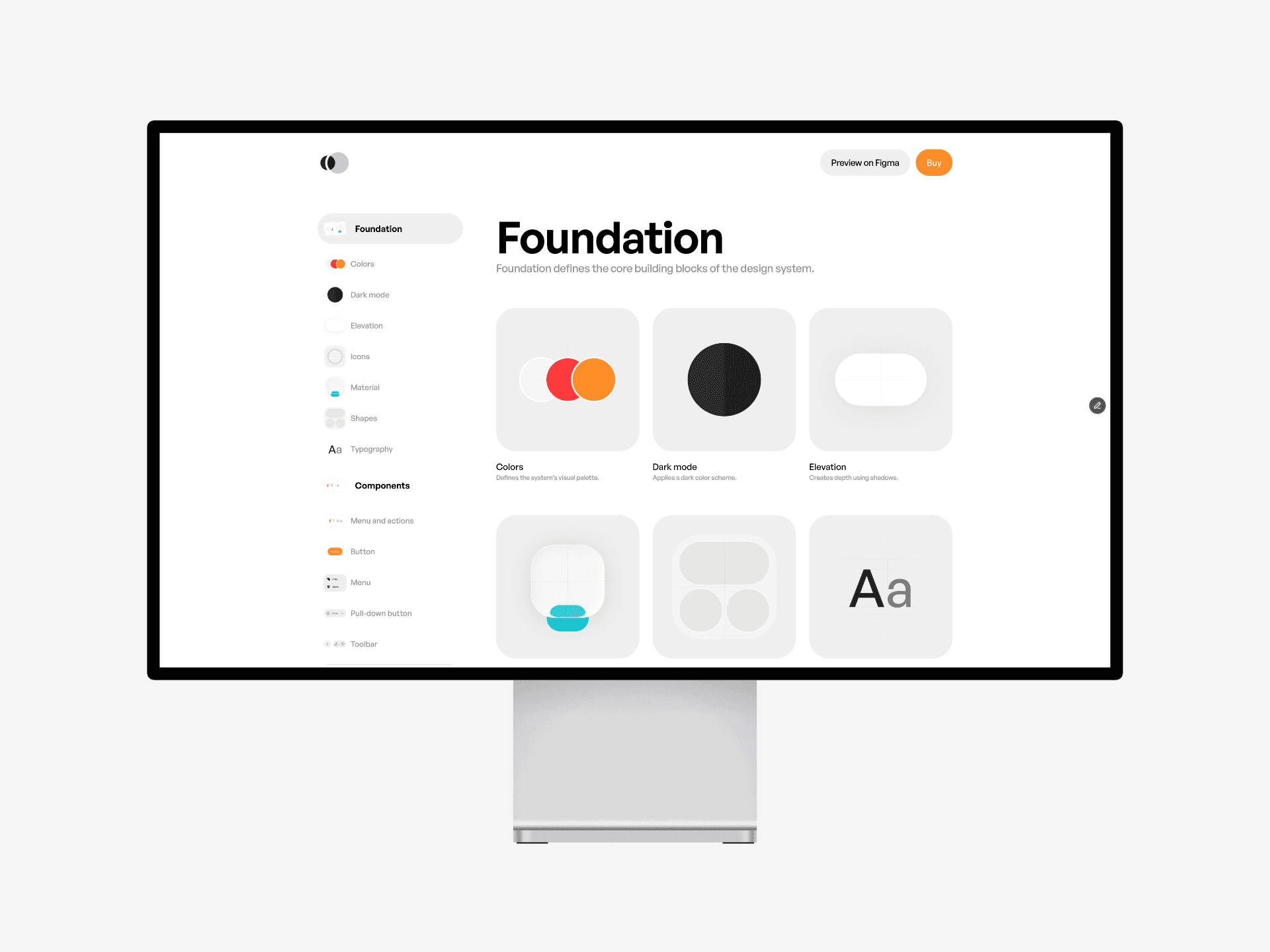
Design System 3 by Sigma
Sigma’s documentation model synthesizes patterns from the systems above into a minimal, structured sequence:
Definition → Guidance → Visual Reference → Examples.
This uniform flow creates a predictable rhythm across pages and allows rapid updates within Figma — where documentation and design coexist.

4. Cross-System Observations
From these six documentation systems, several shared traits emerge:
Structural Predictability — Users rely on consistent sequencing of information and layout.
Contextual Rationale — Each section explains decisions, not just directives.
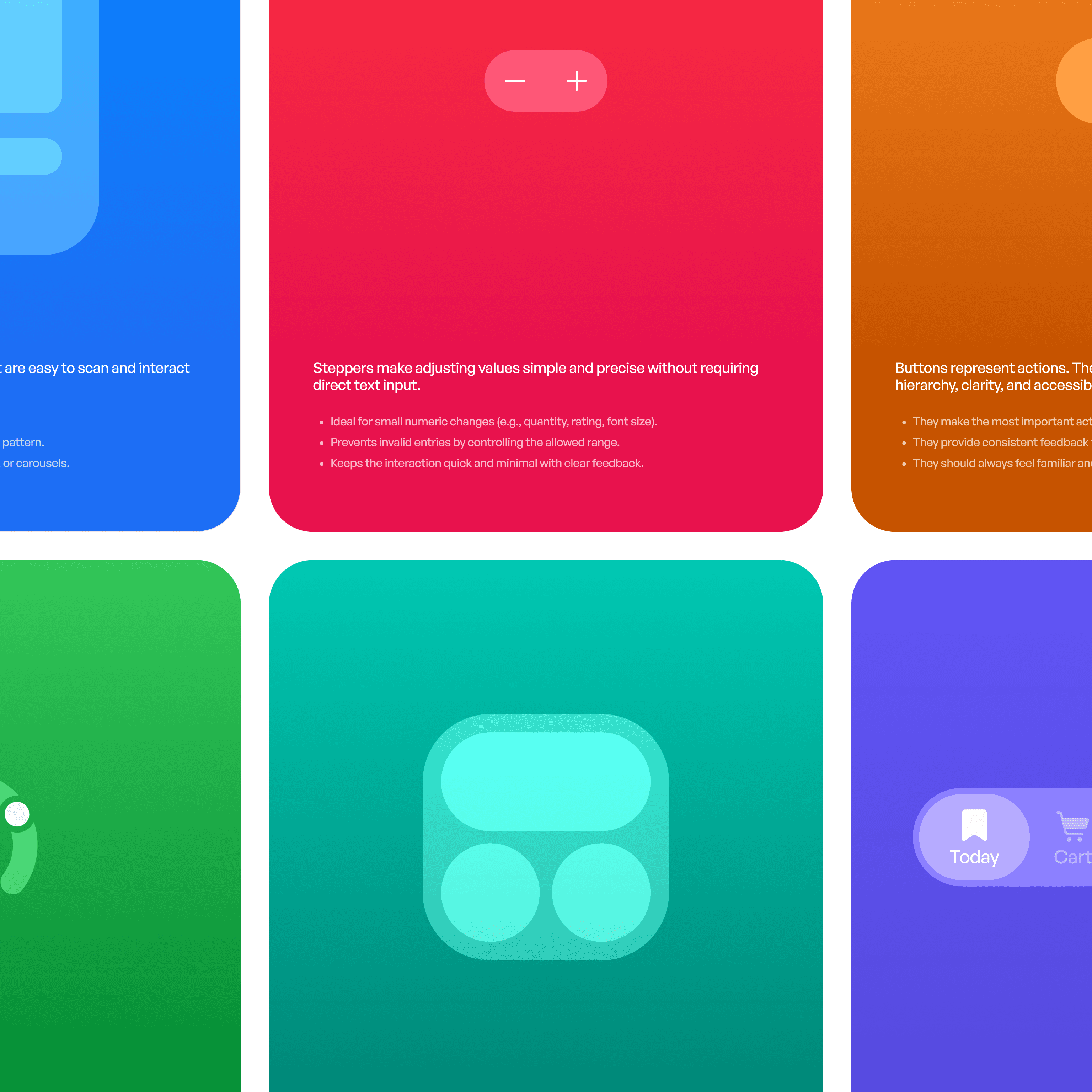
Visual Fidelity — Real components and states are shown rather than simulated.
Cross-Disciplinary Language — Wording bridges design, content, and development without bias toward one discipline.
Iterative Maintenance — Documentation is treated as a product asset, updated continuously rather than periodically.
These findings suggest that documentation functions most effectively when approached as a medium of teaching, not merely as storage.
5. Case Example: Sigma’s Documentation Structure
Sigma’s redesign of its documentation aimed to unify presentation and content.
Instead of external documentation tools, the team used Figma as the source of truth, ensuring design parity between component and documentation assets.
Each entry begins with a definition describing purpose, followed by guidance outlining usage rules and rationale.
A visual reference presents all states (default, focused, disabled, and error).
Examples demonstrate contextual use in layouts.
When motion behavior is relevant, a motion preview is included directly within the file.
This approach eliminated desynchronization between components and documentation, while preserving accessibility for contributors.

6. Practical Implications
Teams aiming to improve their documentation can draw several lessons from these models:
Structure must precede style. Predictability improves comprehension.
Visual references should be generated from actual components, not exports.
The rationale (“why”) must accompany each pattern to prevent mechanical usage.
Documentation should evolve in real time, integrated with the design process.
Tone should remain objective and functional, avoiding marketing language.
In practice, documentation quality correlates directly with design system adoption. Clarity determines trust, and trust determines use.