Design Is Framing: The Role of UI in Product Thinking
Apr 25, 2025
We often think of UI as the surface — buttons, colors, layouts. But the truth is, UI is not just how things look. It’s how people think about what they’re using.
Design is framing.
And framing shapes behavior.
🧠 The Power of Perception
When we design a product, we’re not just shaping pixels — we’re shaping how people perceive value, understand options, and make decisions.
Let’s say your UI shows two pricing plans side by side.
If one is labeled “Best Value,” you’ve framed the comparison.
The features didn’t change.
But perception did.
That’s the role of design most people overlook: it's not just the medium — it’s the message.
🧩 UI as Decision Architecture
Every element in your interface — spacing, copy, order, color — creates mental shortcuts. Designers call this “affordance.” Psychologists call it “framing.”
Think of UI as the architecture of choice.
For example:
A button that says “Continue” feels easier than “Submit Your Data”
A layout with fewer options feels faster to scan, even if the page is the same size
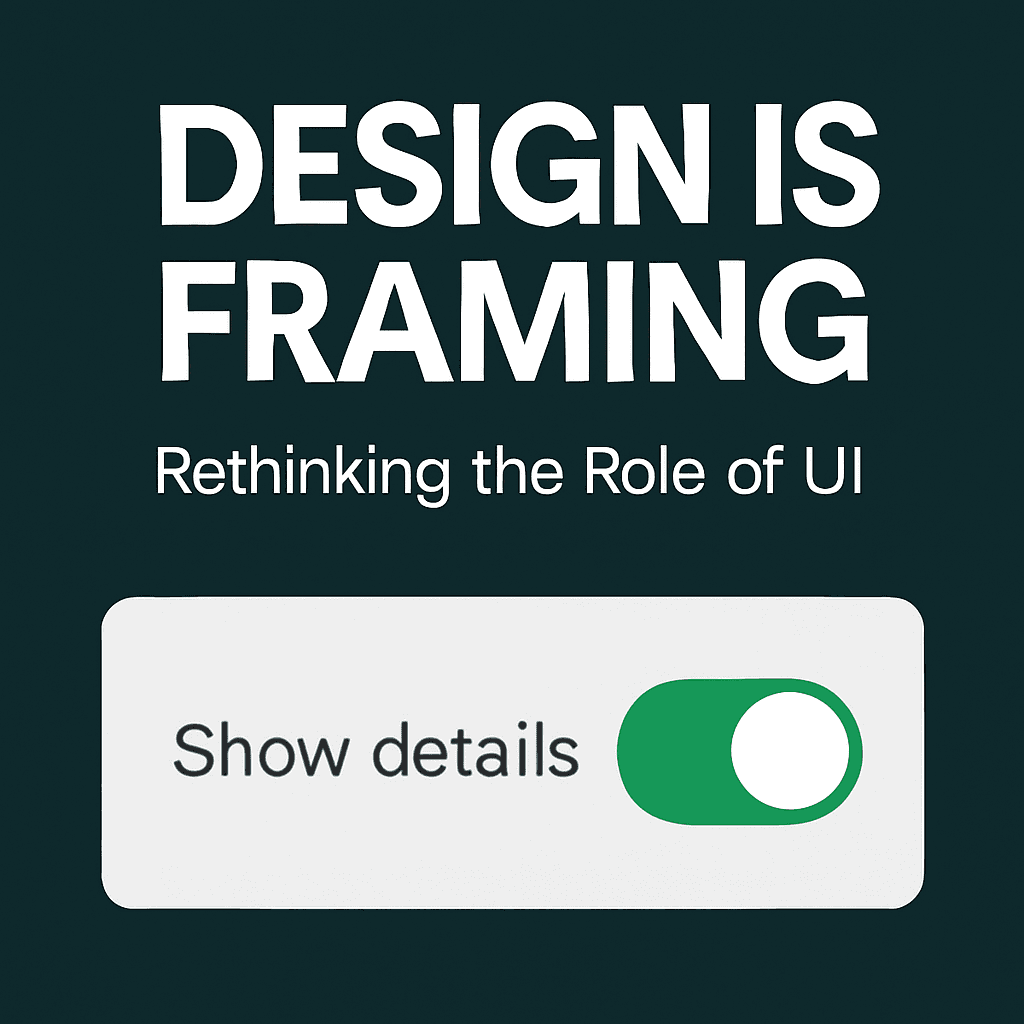
A toggle off by default subtly suggests caution or preference
You're not telling users what to do — but you're guiding them toward it.
🎯 Product Thinking Starts Here
Product thinking isn't about features — it’s about intent.
It asks: what problem are we solving, and what mindset are we designing for?
Let’s compare:
Feature ThinkingProduct ThinkingAdd dark modeHelp reduce eye strainAdd checklistHelp users feel progressAdd searchHelp users feel in control
A designer who understands framing builds the UI around user intent, not internal specs.
💡 Practical Ways to Apply This
Here’s how to shift from “just UI” to meaningful framing:
Start with context, not components
→ Who’s using this? Where? How stressed are they?Make invisible decisions visible
→ What are we assuming users will do?Design with contrast in mind
→ Users don’t read — they compare.Use words intentionally
→ "Free Trial" vs. "Try for Free" — small words, big frames.Simplify paths, not screens
→ Don’t just remove stuff. Remove decision fatigue.
🪞 Why This Matters
When you frame poorly, people hesitate.
When you frame well, people feel confident — and move forward.
Good UI doesn’t just work. It makes people feel like they know what they’re doing.
That’s the invisible magic of product design.
📘 Want to Dive Deeper?
Our guide User Psychology 3 is packed with psychological principles like framing, loss aversion, and decision inertia — all explained visually, so you can design smarter and with more empathy.