Confirmation Bias in UX: How to Design for User Beliefs
Users don’t come to your interface as blank slates.
They arrive with assumptions — and they look for confirmation.
This mental shortcut is called confirmation bias, and it shapes how people interpret your UI, your copy, and even your errors.
If you ignore it, your design can confuse or frustrate users.
If you design with it, you create clarity, confidence, and trust.
🧠 What Is Confirmation Bias?
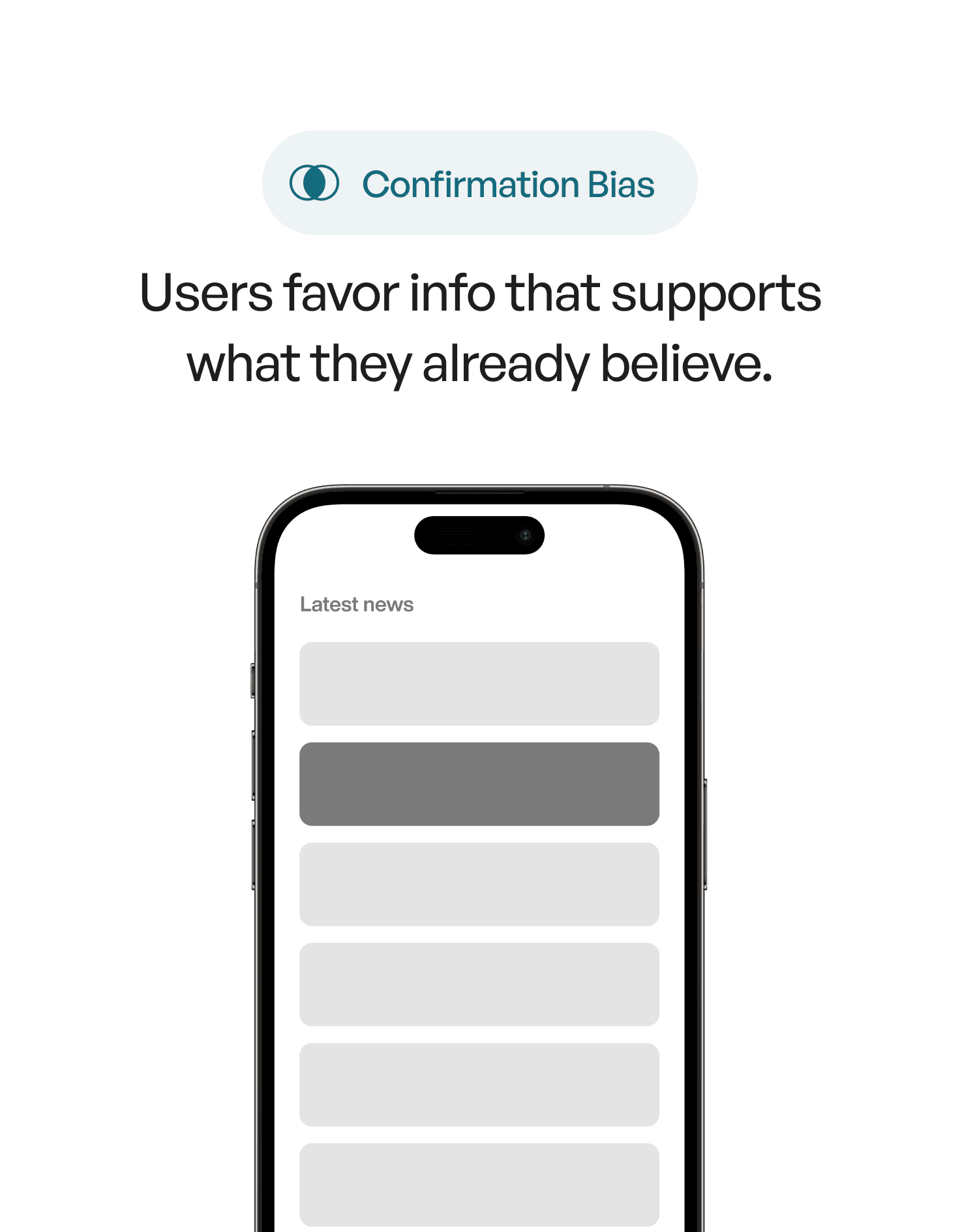
Confirmation bias is the tendency to seek out, interpret, and remember information that confirms what we already believe — while ignoring what contradicts it.
In UX, this means users:
Expect certain layouts or wording
Ignore UI elements that contradict their mental model
Interpret feedback in line with what they thought would happen
💬 We don't just use products. We interpret them through our existing beliefs.
🧭 Why It Matters in UX Design
Let’s say your product uses an unfamiliar navigation icon.
If users expect a hamburger menu but see a cube icon instead, they might not explore it — even if it's functional.
Their brain filters it out because it doesn’t match what they’re expecting.
Or think of error messages:
If users expect that clicking a button will save something — but they see a warning — they may dismiss it without reading, assuming the system is wrong.
💬 Users trust their expectations more than your UI.
✅ How to Design with Confirmation Bias in Mind
1. Align with Mental Models
Use patterns your audience already knows.
Unless you have a good reason, don’t reinvent standard UI interactions.
→ Use familiar iconography
→ Stick to predictable language
→ Borrow patterns from tools your users already trust
2. Confirm Expectations Before You Break Them
If you must do something new, explain it early.
→ Use tooltips, guided flows, or microcopy to reset expectations
→ Label icons clearly (at least once)
→ Let users test new interactions in low-risk areas first
3. Design Feedback That Matches the User’s Story
Confirmation bias affects how people interpret success and failure.
→ If an error contradicts what users expected, explain why
→ Align copy tone with user emotions (don’t be robotic when they’re frustrated)
→ Reassure users when their expectations were right — or gently reset them when they weren’t
4. Avoid Overwhelming with Contradictions
Too much unexpected behavior at once can lead to distrust.
→ Introduce changes gradually
→ Offer undo options or ways to revert
→ Highlight benefits of new behavior (give users a reason to update their beliefs)
🎨 Real-World Example
🧪 Old UI:
Button says “Save” but triggers an autosave — user sees no feedback and assumes it didn’t work.
🧠 Biased Thinking:
“I’ve used Save buttons before — they always confirm. This must be broken.”
✅ Improved UI:
Add micro-feedback: “Changes autosaved” or show a visual cue with a timestamp.
Now the user’s expectations are confirmed — just in a new way.
📘 Want to Master UX Psychology?
User Psychology 3 is our ebook made for designers who want to understand how users think — and how to design for it.
Inside, you’ll find:
100+ principles like confirmation bias, Hick’s Law, and the Peak-End Rule
Visual examples
Real-world UI breakdowns
Common mistakes + how to avoid them
If you want your design to feel obvious, start with how people actually think.