Calm Interfaces: The New UX Advantage
May 9, 2025
Most products compete for attention.
The best ones give you peace.
In an age of endless notifications, motion, and mental clutter, calm interfaces are becoming a strategic advantage — not just a design preference.
Let’s explore what makes an interface feel calm, why it matters, and how to design one that users actually enjoy returning to.
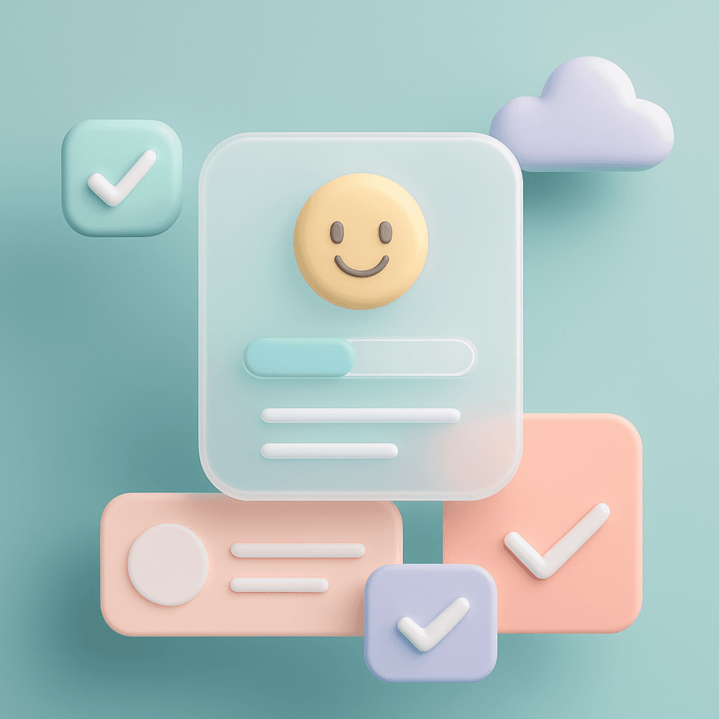
🧠 What Are Calm Interfaces?
Calm interfaces reduce noise, guide focus, and create emotional clarity.
They help users feel in control, not overwhelmed.
They’re not just “minimal.”
They’re intentional — about motion, color, copy, space, and rhythm.
💬 Calm is not silence. Calm is clarity.

🎯 Why Calm Matters Now
Users are digitally overstimulated
Competing UIs fight for attention — not trust
Cognitive fatigue reduces task success
Products that feel effortless are more likely to be remembered and reused
💬 We’re not just designing screens. We’re designing mental environments.
🧪 The Psychology Behind Calm UX
Cognitive Load Theory: Fewer distractions = more focus
Predictability: Familiar patterns reduce anxiety
Emotional Design: Calm = safety = trust
🛠️ How to Design Calm Interfaces
1. Use Space Generously
✅ Let layouts breathe
✅ Group related elements
✅ Avoid cramming content
💬 Whitespace is mental space.
2. Limit Visual Noise
✅ Stick to a restrained color palette
✅ Use subtle motion (or none)
✅ Avoid too many text weights, shadows, or outlines
💬 Every detail should earn its place.
3. Guide Focus, Don’t Fight for It
✅ Use clear visual hierarchy
✅ Highlight one primary action
✅ Reduce competing CTAs
💬 Calm interfaces respect your attention.
4. Slow Down Feedback (Just Slightly)
✅ Add subtle transitions (vs instant jump-cuts)
✅ Use microanimations to signal success
✅ Avoid abrupt layout shifts
💬 A little rhythm goes a long way.
5. Use Friendly, Simple Microcopy
✅ Replace jargon with calm, human tone
✅ Make error messages reassuring
✅ Default to language that reduces pressure (“Save draft” > “Submit now”)
💬 Words are emotional UX.

✨ Brands That Do Calm Well
Apple: Clean transitions, no unnecessary motion
Headspace: Gentle UI rhythm and tone
Dropbox: Clear hierarchy and soft visuals
Stripe: Functional calm — dense info, zero chaos
📘 Want to Design Calmer Products?
User Psychology 3 is our guide to building emotionally intelligent design — from attention and trust to cognitive load and clarity.
If you want to build calm into your interface, this is where to start.