Juxtaposition in UX Design: How Contrast Creates Clarity & Meaning
Dec 12, 2025
Users don’t understand interfaces in isolation.
They understand them in comparison.
A button feels primary because something else feels secondary.
A feature feels premium because another feels basic.
A screen feels simple because complexity is placed somewhere else.
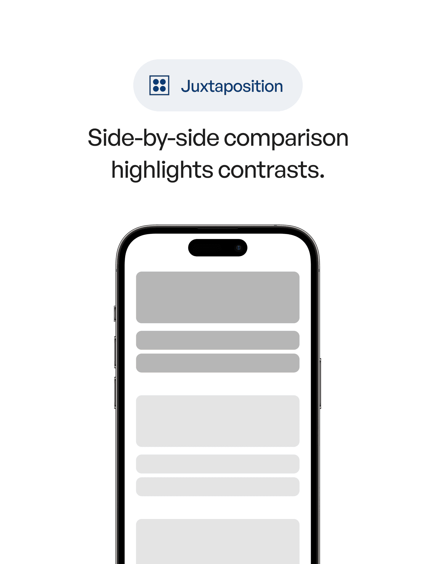
This is the psychology of juxtaposition — meaning created through contrast.
1. What Is Juxtaposition? (Definition)
Juxtaposition is a psychology and design principle where two or more elements are placed side by side so their differences become clear.
In UX, juxtaposition helps users instantly understand:
what matters more
what’s different
what’s better
what’s optional
what’s urgent
what’s safe to ignore
Without juxtaposition, everything blends together.
With it, meaning emerges naturally.
2. The Psychology Behind It
The human brain is exceptional at detecting difference.
We don’t evaluate things absolutely — we evaluate them relatively.
Juxtaposition works because:
1. Contrast sharpens perception
Differences in size, color, spacing, or tone are processed pre-attentively.
2. Comparison reduces cognitive load
Instead of analyzing everything, users quickly rank options.
3. Meaning is contextual
A “large” button is only large compared to something smaller.
4. Choice becomes clearer
Juxtaposition eliminates ambiguity by making priorities visible.
In short:
contrast is cognition made visible.
3. Why Juxtaposition Matters in UX Design
Because most UX problems are not about missing features —
they’re about unclear relationships.
Juxtaposition helps with:
visual hierarchy
decision making
pricing clarity
feature comparison
onboarding clarity
reducing cognitive load
guiding attention
showing progress or change
Great UX doesn’t explain — it shows.
Juxtaposition is one of the most efficient ways to show.
4. Real-World Example
Imagine a pricing page.
Version A
All plans use the same color
Same font size
Same visual weight
Same layout
Users hesitate.
They start reading carefully.
Cognitive load increases.
Version B
One plan is visually emphasized
Others are quieter
Differences are obvious at a glance
The recommended option is framed through contrast
Now users don’t ask: “Which one should I choose?”
The interface answers silently.
That’s juxtaposition at work.
5. Common Mistakes (And How to Avoid Them)
❌ Mistake 1: Designing everything to look “consistent”
Over-consistency kills clarity.
Fix:
Use contrast intentionally to express importance.
❌ Mistake 2: Relying on labels instead of visual difference
Text explanations add cognitive load.
Fix:
Let size, spacing, and color do the talking.
❌ Mistake 3: Juxtaposing too many things at once
Too many contrasts create noise.
Fix:
Choose one dominant comparison per screen.
❌ Mistake 4: Using contrast without intention
Random contrast feels chaotic.
Fix:
Every contrast should answer a question: Why does this matter more?
❌ Mistake 5: Forgetting accessibility
Contrast isn’t only aesthetic.
Fix:
Ensure color contrast works for all users.
6. How to Apply Juxtaposition in UX (Practical Techniques)
1. Contrast primary and secondary actions clearly
Users should never hesitate between them.
2. Use spacing as a comparative tool
Elements with more space around them feel more important.
3. Show change through before/after states
Progress is best understood through juxtaposition.
4. Compare states, not explanations
Enabled vs disabled
Free vs paid
Basic vs Pro
Let the difference speak visually.
5. Use light vs heavy, calm vs bold
Emotional contrast guides behavior.
6. Reduce explanation text
If you need to explain the difference, the contrast isn’t strong enough.
7. Key Takeaways
Juxtaposition creates meaning through contrast
Users understand interfaces by comparison, not isolation
Visual differences reduce cognitive effort
Strong UX shows priorities instead of explaining them
Clarity emerges when contrast is intentional

📘 Want to Go Deeper Into UX Psychology?
If you want to master 60+ psychology principles that shape how users perceive, compare, and decide, explore
User Psychology 3 — our complete handbook for applying psychology in modern interface design.