Redesigning the iPhone Music App. An Already amazing experience.
Mar 12, 2026
The Idea
The current iPhone music player already treats content well.
Album art is large. Typography is confident. Controls stay minimal.
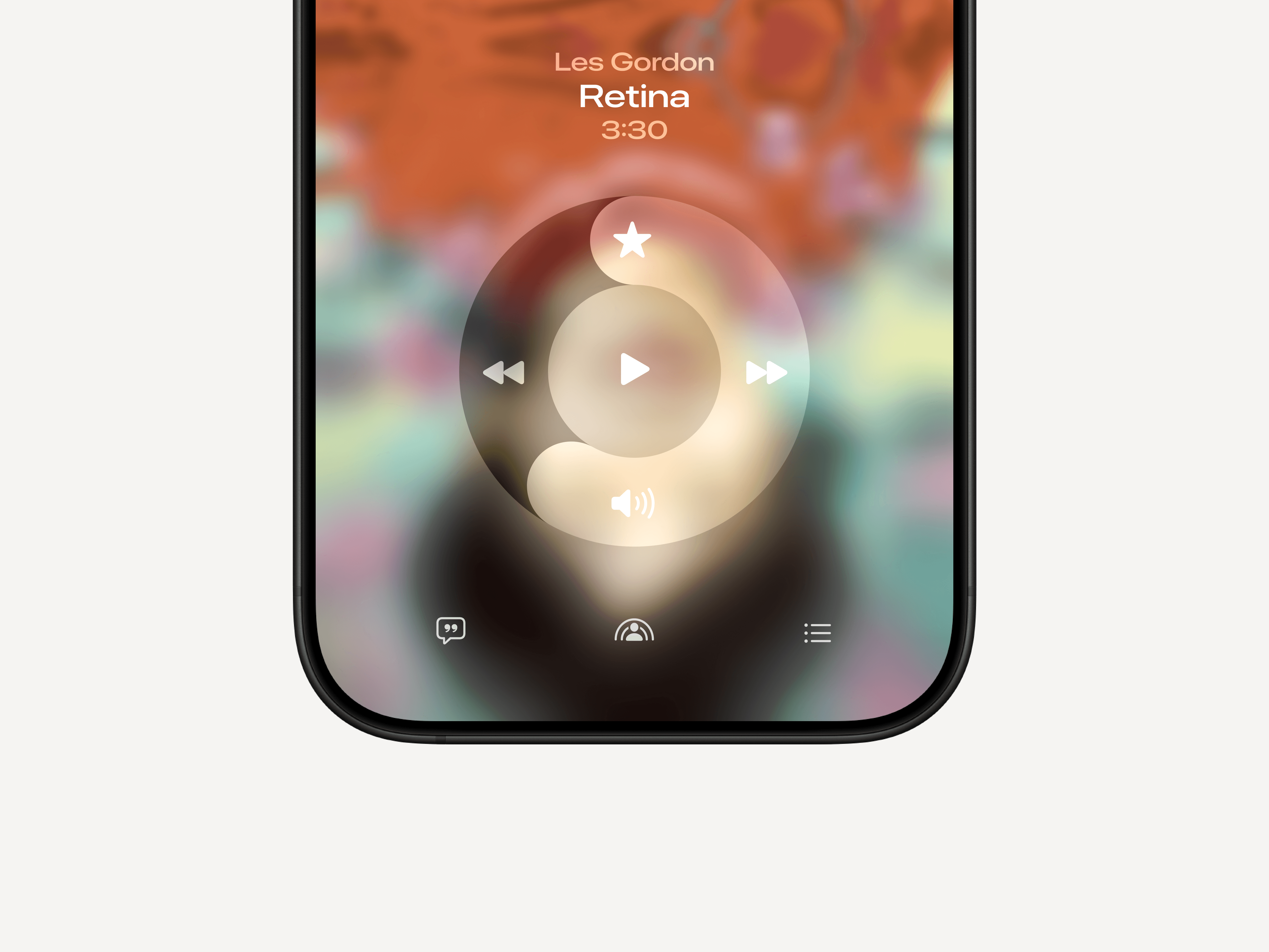
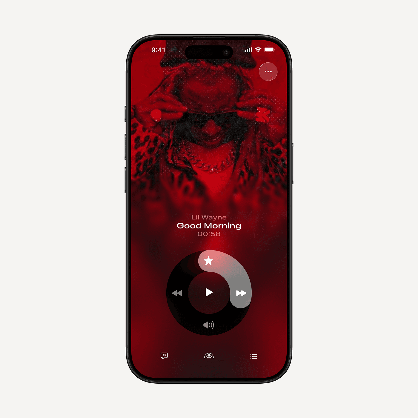
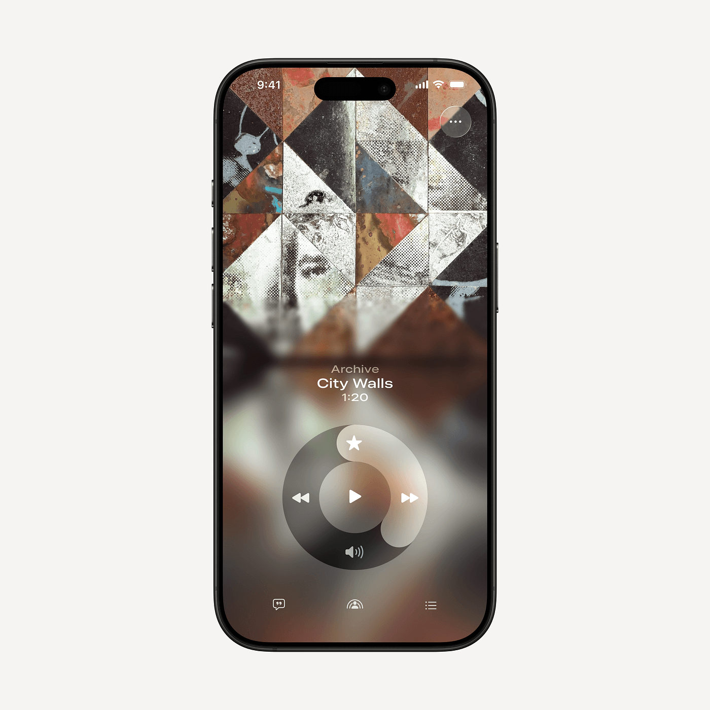
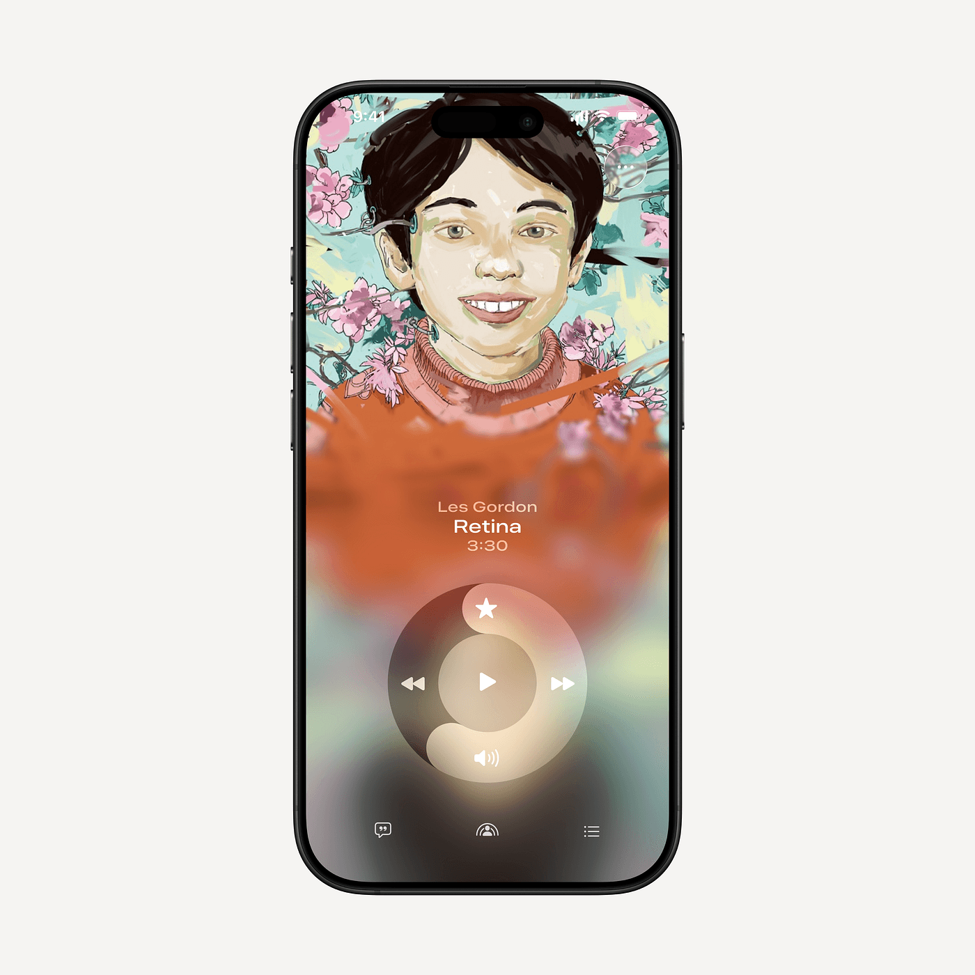
What if the controls could be a little different. Cooler and reflecting Apple legacy.
a little more physical too.
So the idea was simple:
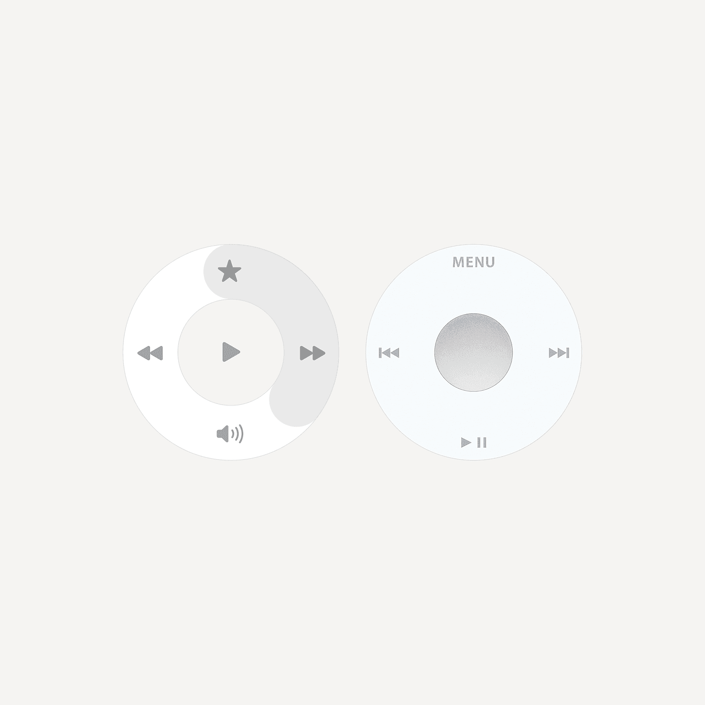
What if the primary control of the player behaved like the iPod wheel?
Not as a nostalgic throwback.
As a better way to interact with music.
Why the Wheel Works
The original iPod wheel solved several interaction problems at once.
1. Continuous control
Music timelines are not binary actions.
You don’t jump from A to B.
You move through time.
A wheel maps perfectly to that behavior.
Turning the wheel = moving through the track.
No dragging a thin progress bar.
No tiny gestures.
Just dial the song forward or backward.
2. Muscle memory
The wheel creates a circular gesture language.
Users quickly learn:
• rotate slowly → precise scrubbing
• tap center → play / pause
It becomes almost instrument-like.
You’re not pressing buttons anymore.
You’re playing the interface.
3. A connection to Apple’s legacy
Apple’s best interfaces always had personality tied to the medium.
The iPod wheel wasn’t just control — it was identity.
Reintroducing that interaction inside a modern player does something interesting:
It connects Apple Music today with the object that defined digital music.
Why This Fits the Content-Layer Philosophy
Your core idea about interfaces giving the content layer its own language fits here perfectly.
Music is rhythm, motion, and flow through time.
A circular control expresses that much better than a static progress bar.
The interface starts to feel less like a generic media player and more like a musical object.