Redesigning iPhone clock app.
Mar 12, 2026

Care.
It’s difficult to describe, but when a product is made with care, you feel it immediately. Every element seems to belong. Every detail seems intentional. The interface disappears and what remains is the experience itself.
Lately I’ve been exploring this idea while working on my design system. My goal has been to position the system primarily as a navigational layer, while giving the content layer more freedom to express its purpose.
Most modern interfaces look the same because we treat every screen with the same structural language. The navigation is consistent, but the content becomes generic.
What if we reversed that?
What if the navigation remained simple and predictable, while the content itself could take on a form that reflects what the product actually is?
That question led me to rethink an app we all use.
The Clock app.
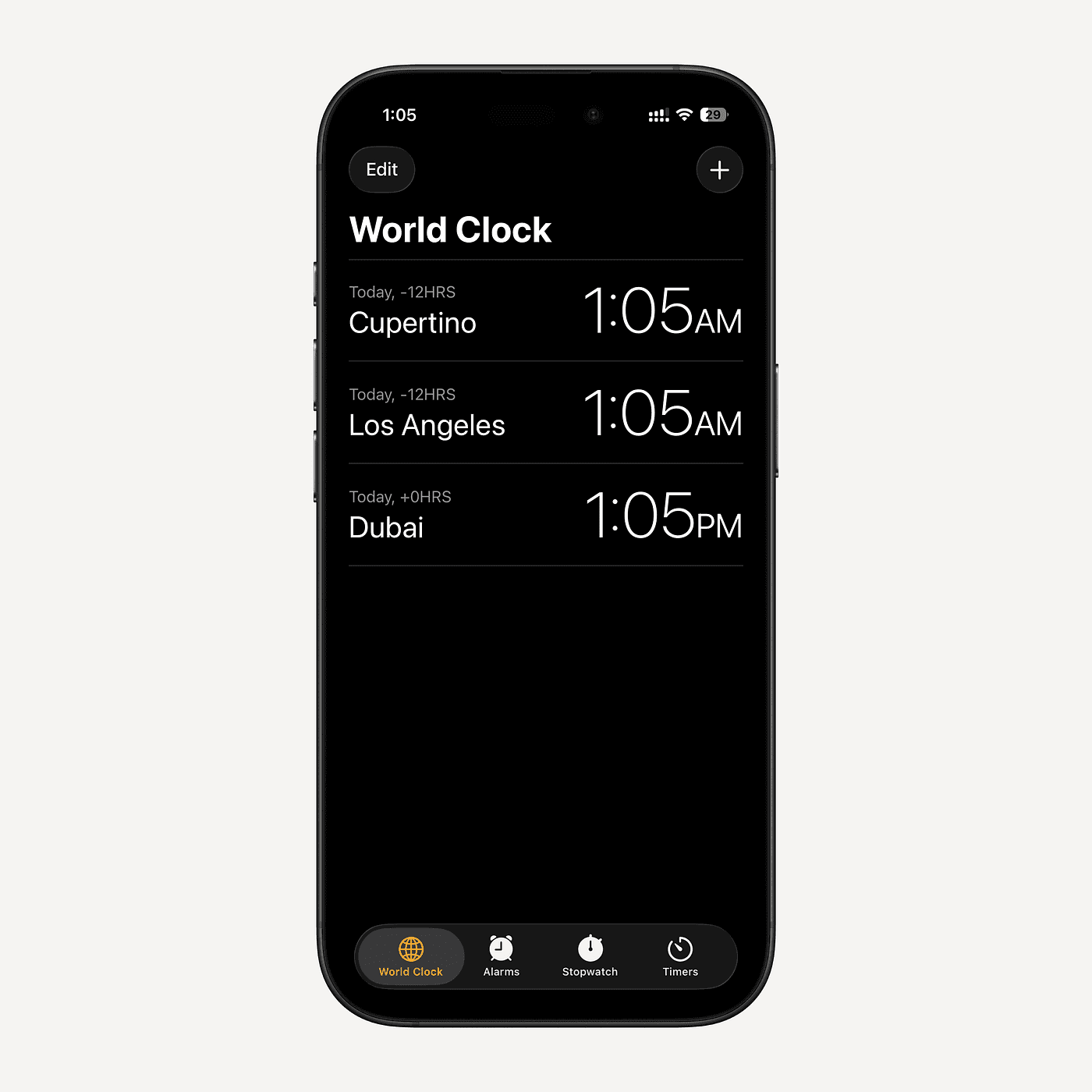
A Look At iPhone Clock App
The default iPhone Clock app works perfectly.
But it feels a bit soulless in a sense.
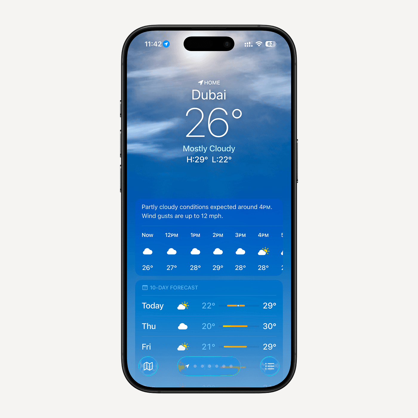
When you compare it to Apple’s Weather app, the difference becomes obvious. The Weather app feels alive. It responds to conditions. It creates atmosphere. It turns a simple utility into an experience.
I think time could be the same.
Timepieces have always been objects of design. Watches, clocks, and chronographs are often works of art. Designers obsess over their typography, proportions, and mechanical precision.
Yet the Clock app on the iPhone is simply a list.
For something as poetic as time, that felt like a missed opportunity.
The Inspiration: Bauhausclock
One design that has stayed in my mind for years is Bauhausclock by Attila.
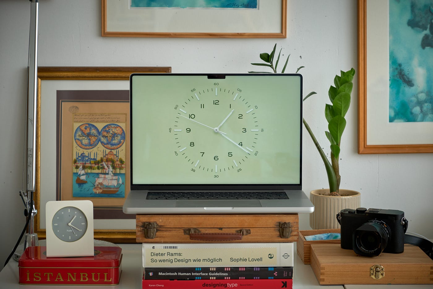
It’s an incredible piece of work.
Minimal.
Precise.
You could feel that it’s build with tremendous amount of care.
It captures something that many digital clocks miss: the emotional character of timepieces.
When I looked at it again recently, the idea became obvious.
What if the iPhone clock was designed like a Bauhaus timepiece?
That thought became the starting point.
The First Problem: The Circle
Naturally, the first instinct is to build a circular clock.
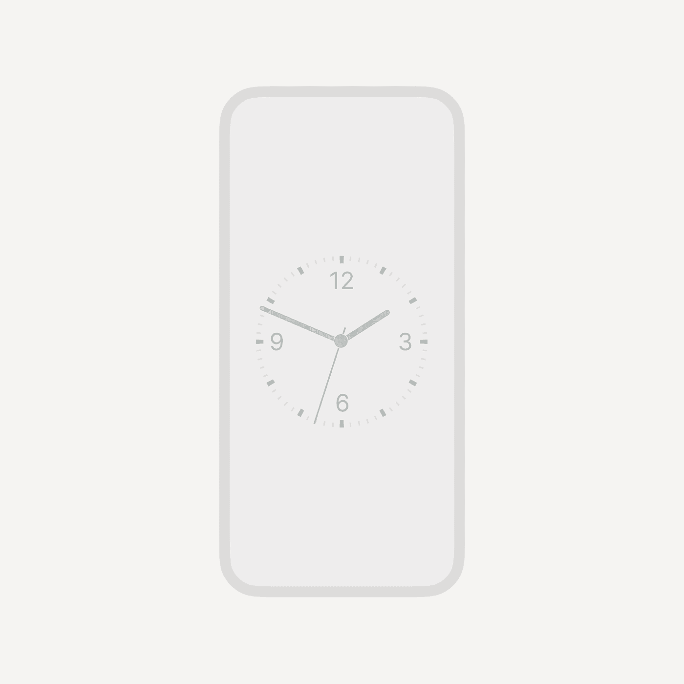
After all, clocks are circular.
But once I started designing, something felt wrong.
The circle works beautifully as an object, but on the iPhone screen it felt disconnected from the device. It sat awkwardly inside the rectangular frame, leaving too much unused space.
It looked beautiful.
But it didn’t feel right.
So instead of forcing the circle into the screen, I started exploring a different approach.
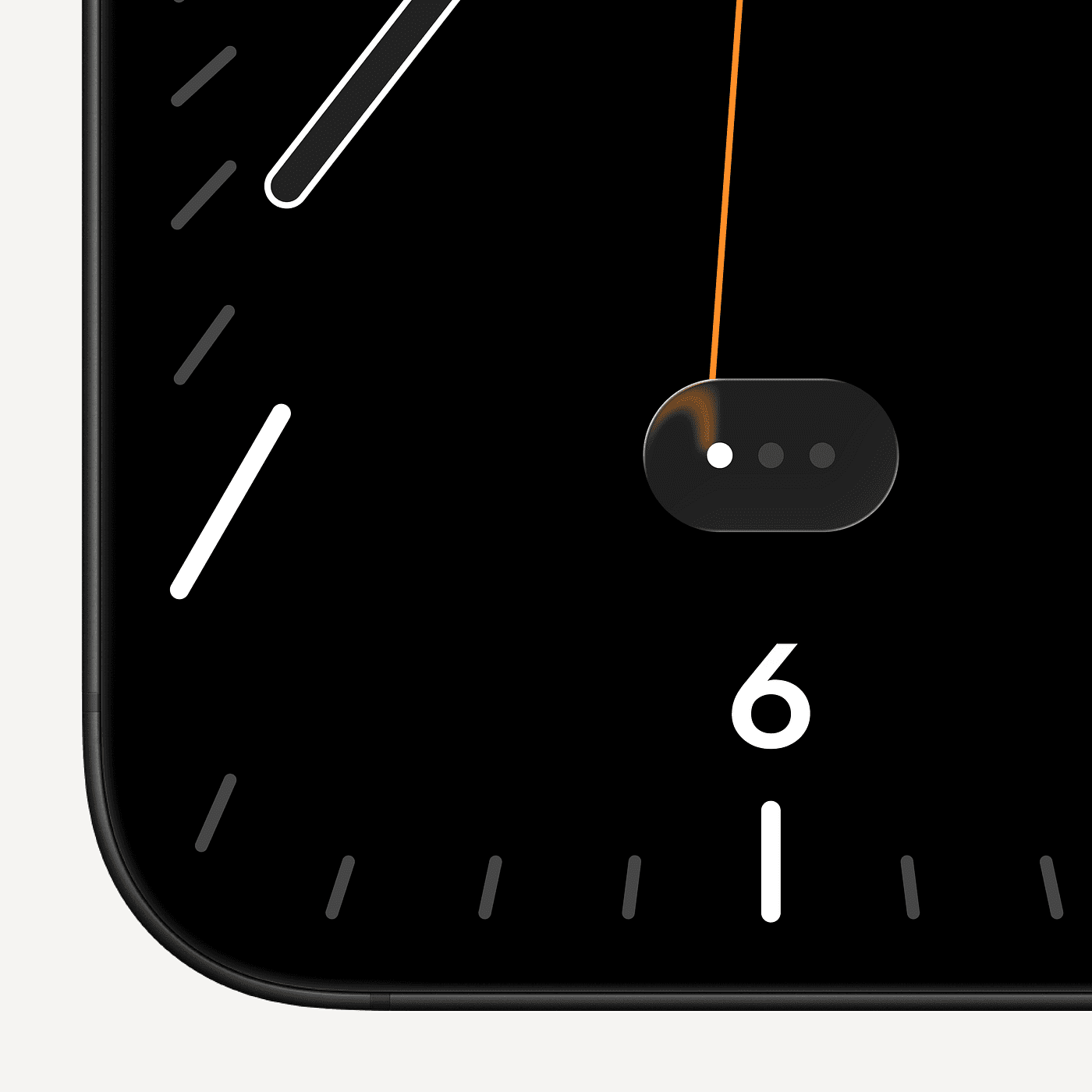
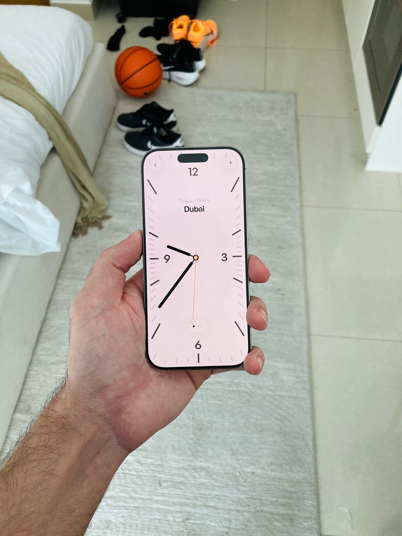
A Clock That Wraps the Screen
Rather than placing the clock inside the interface, I designed a grid that wraps around the edges of the screen.
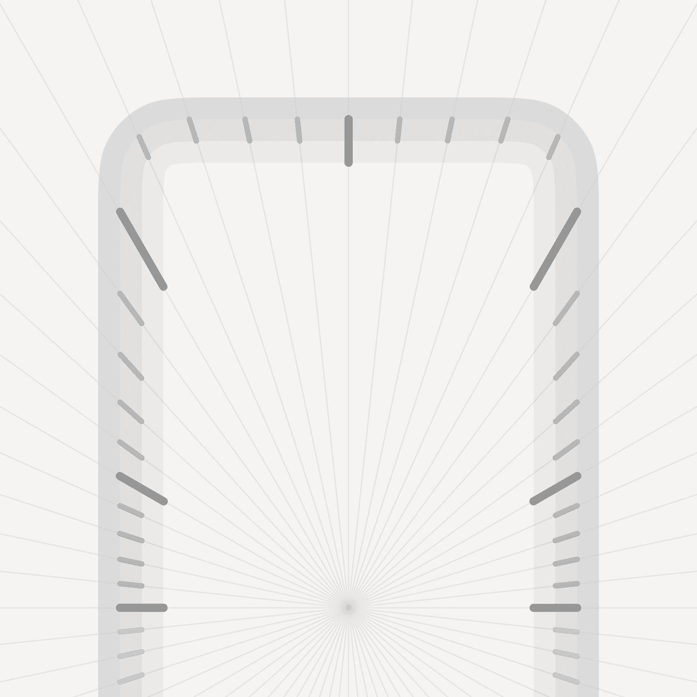
The interface becomes the timepiece itself.
The elements follow the edges of the device precisely, creating a structure that feels native to the phone rather than borrowed from physical clocks.
This grid allowed the layout to breathe. It created strong geometry while still leaving space for the time to remain the focal point.
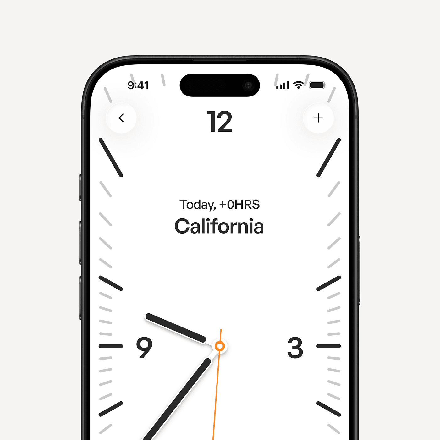
Instead of a floating clock, the entire interface becomes the clock.
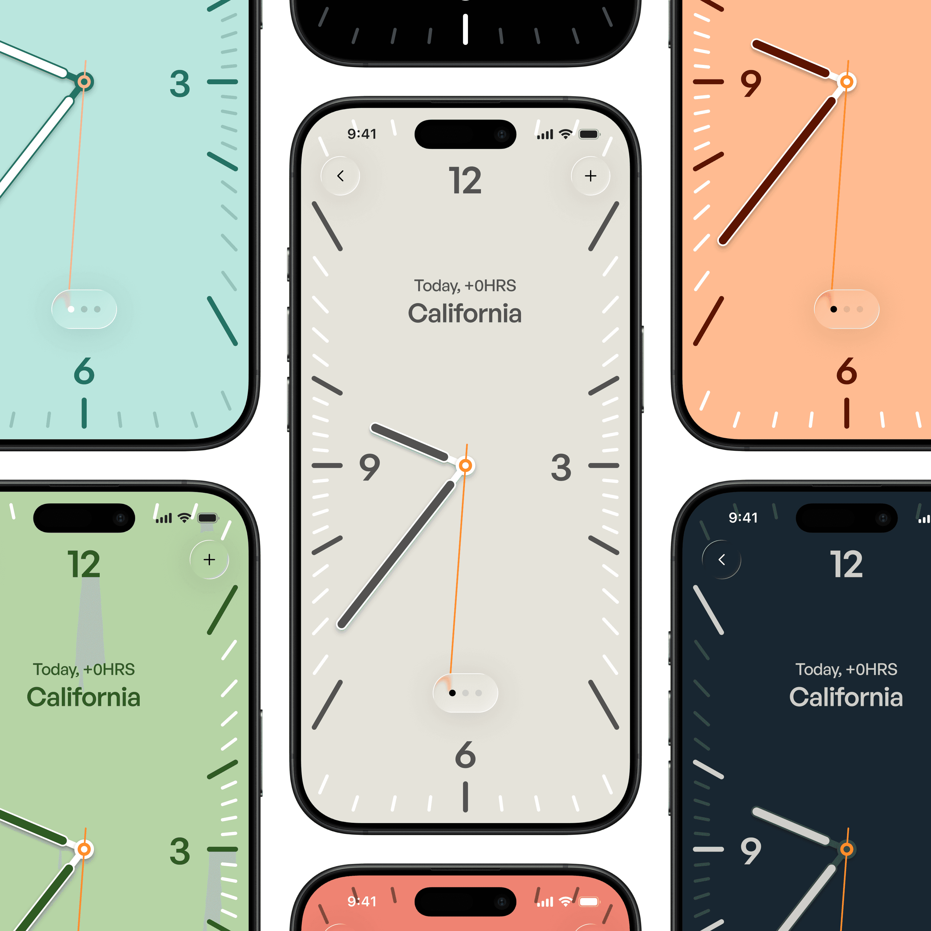
Bringing the Weather App Experience
Another inspiration came from Apple’s Weather app.
One of the most elegant aspects of that interface is how you move between locations. Instead of navigating through menus, you simply swipe horizontally.
Each city becomes a full-screen experience.
I applied the same idea to the clock.
Users can set multiple locations and swipe between them, turning time zones into a spatial experience rather than a list.
Each location becomes its own timepiece.
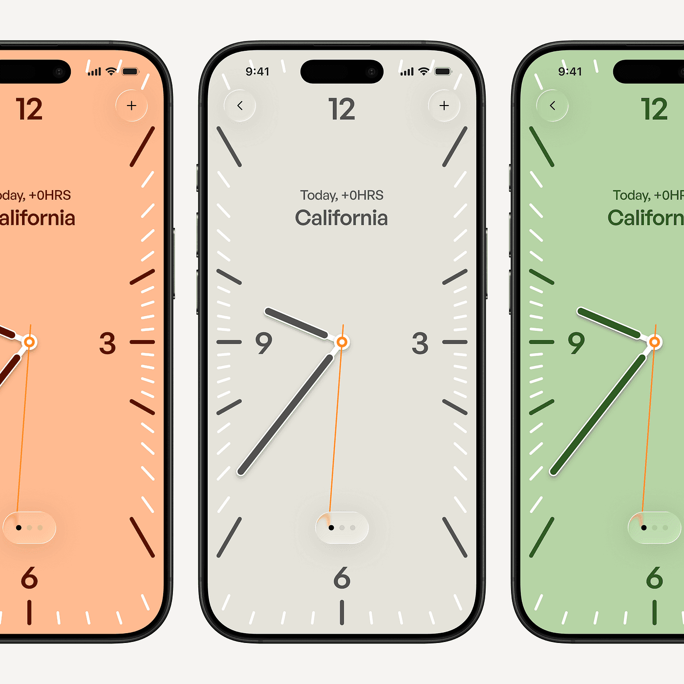
The interface expands and contracts as you move between them, creating a sense of depth and rhythm.
Time stops feeling like data.
Designing the Content Layer
This experiment reinforced something I’ve been thinking about for a while.
Interfaces should not force every feature into the same structural template.
Navigation can remain consistent and predictable, but the content layer should adapt to what the product actually represents.
A music player should feel like music.
A weather app should feel atmospheric.
A clock should feel like a timepiece.
Design systems often standardize everything to the point where the interface loses its character.
But the goal isn’t uniformity.
The goal is clarity.
And sometimes clarity means allowing the interface to take a form that reflects the soul of what it represents.
Care Is Visible
This redesign started as an exploration, but it reminded me why I care so much about design systems in the first place.
A good system shouldn’t flatten creativity.
It should make room for it.
When the structural layer is solid, the content layer can evolve into something more expressive.
And when that happens, the difference becomes obvious.
You can feel when something was built with care.